36 Days of Typography
Graphic Design, Art Direction



PROJECT OVERVIEW
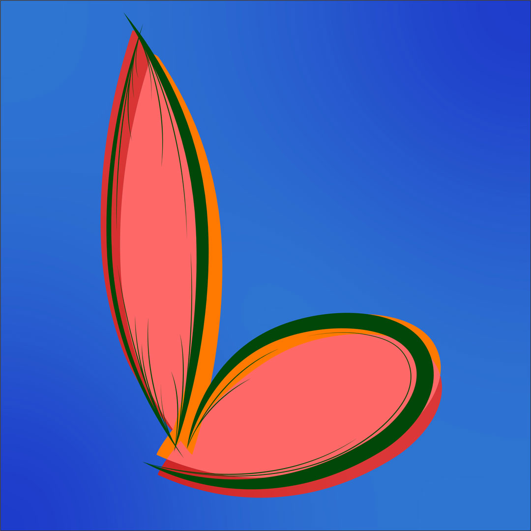
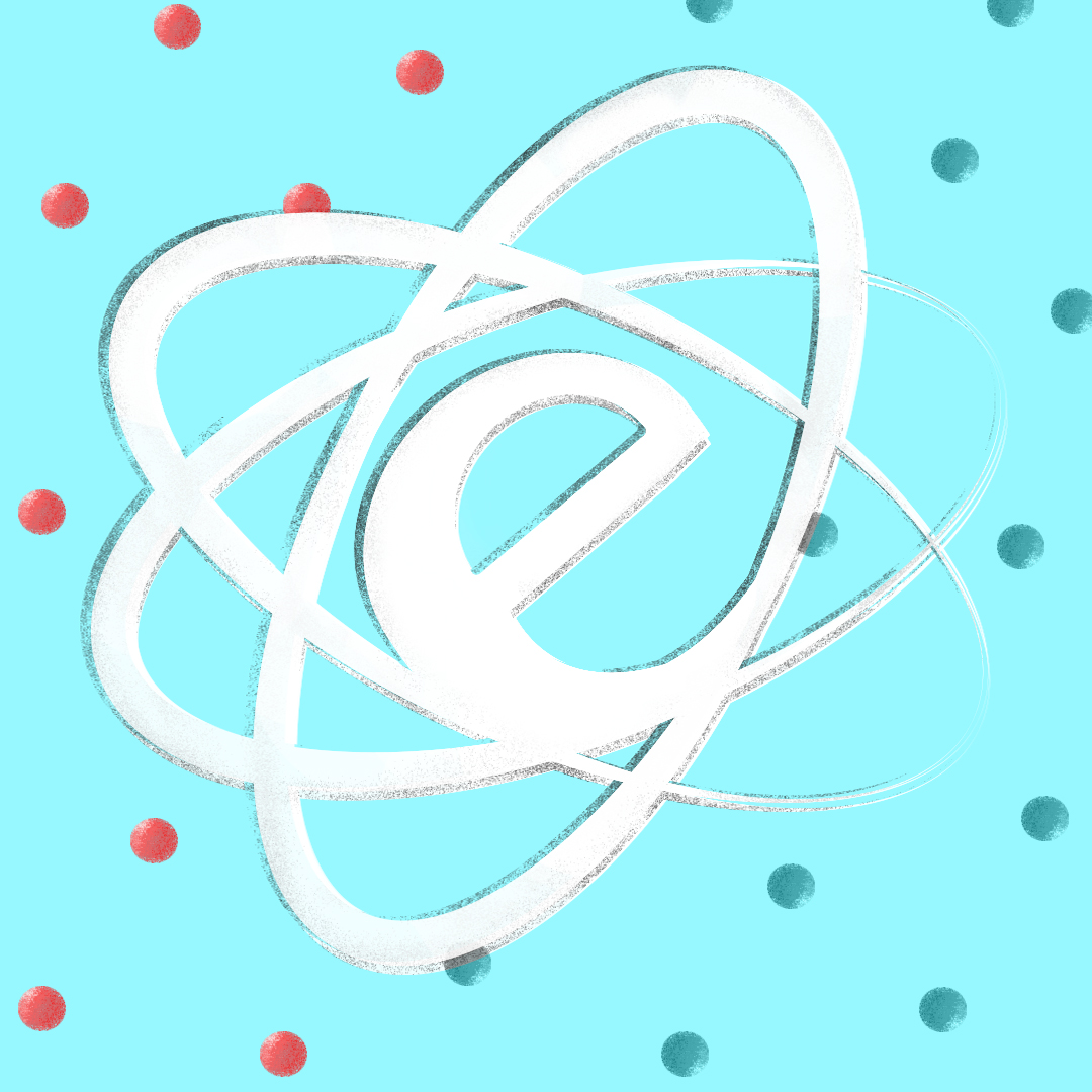
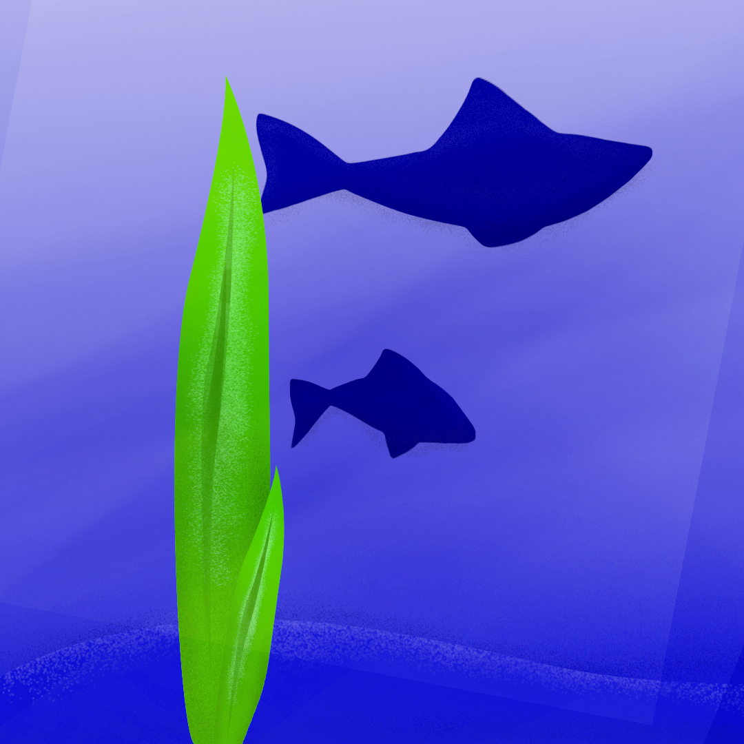
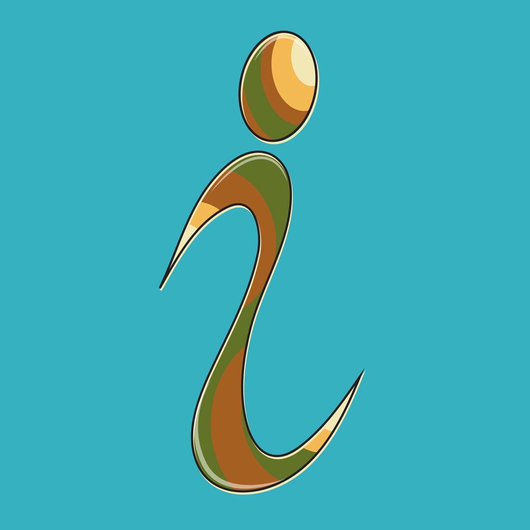
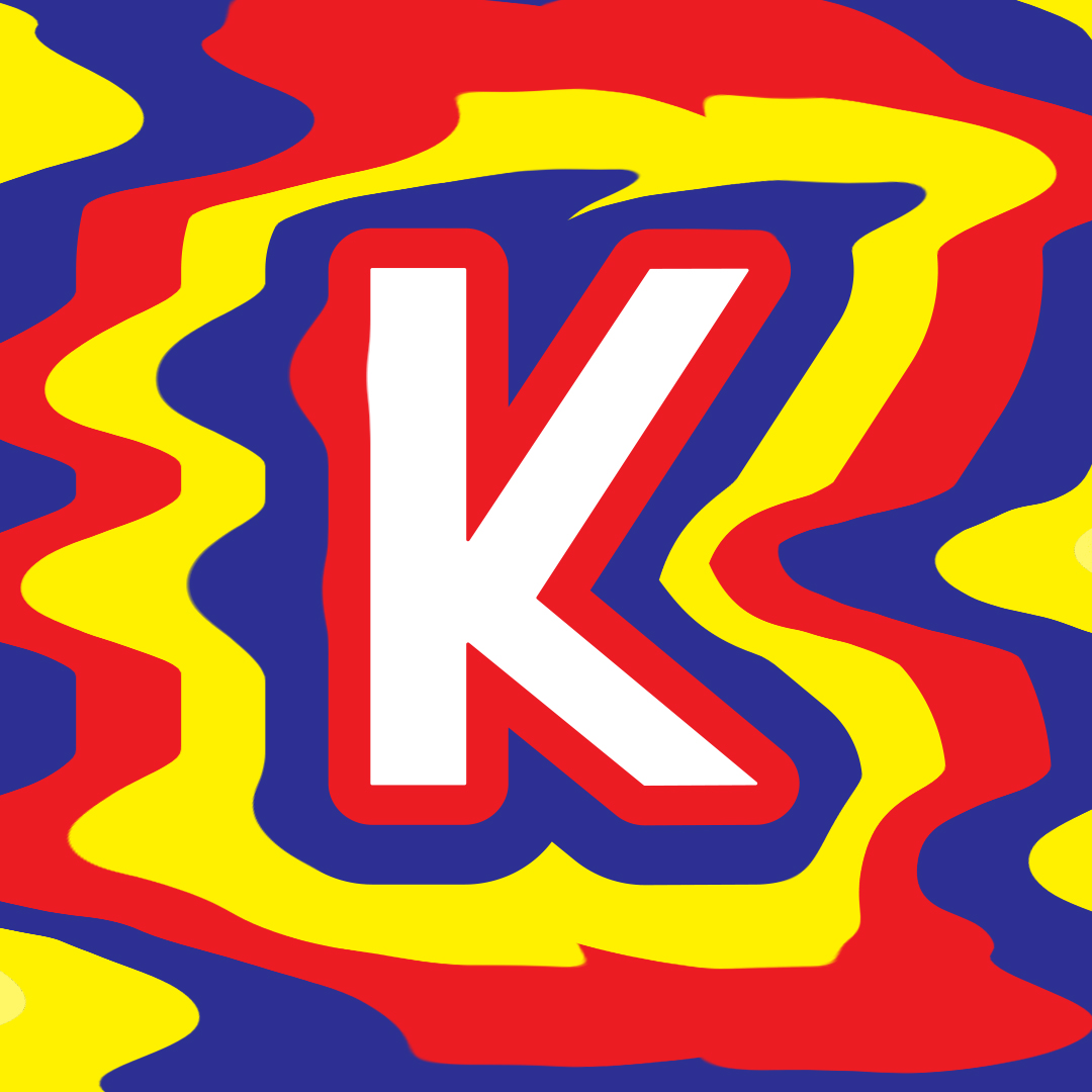
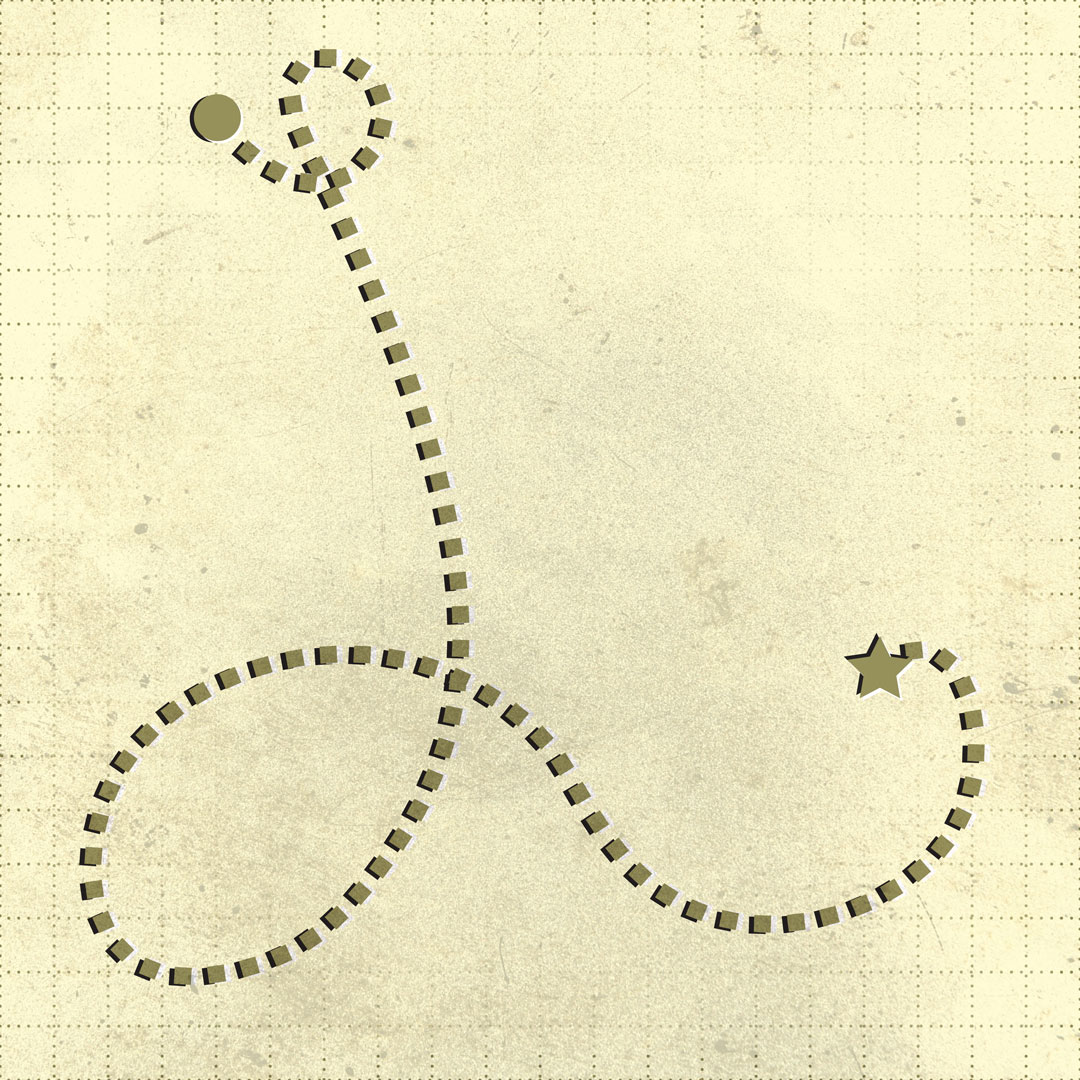
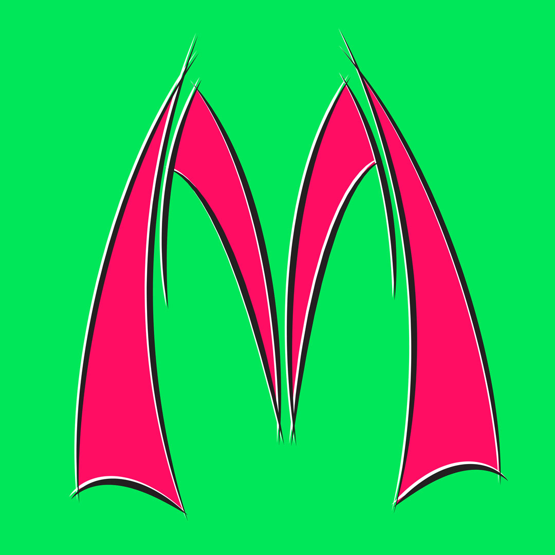
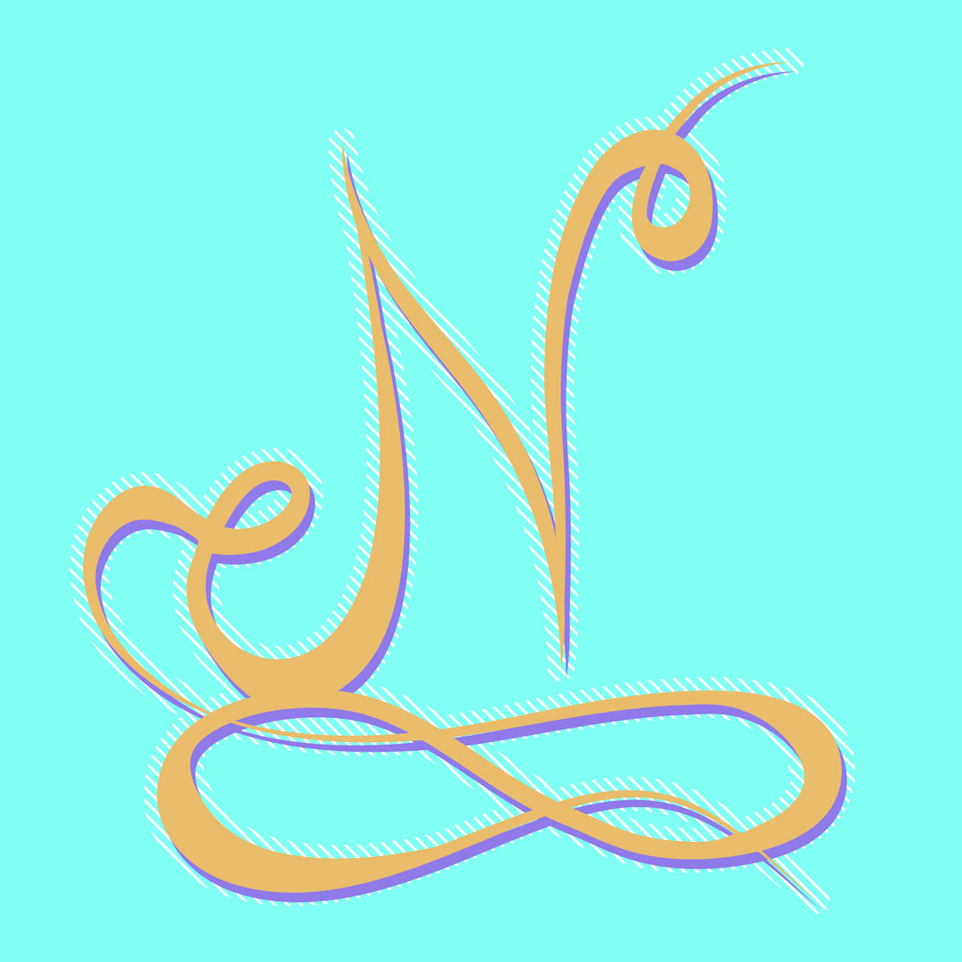
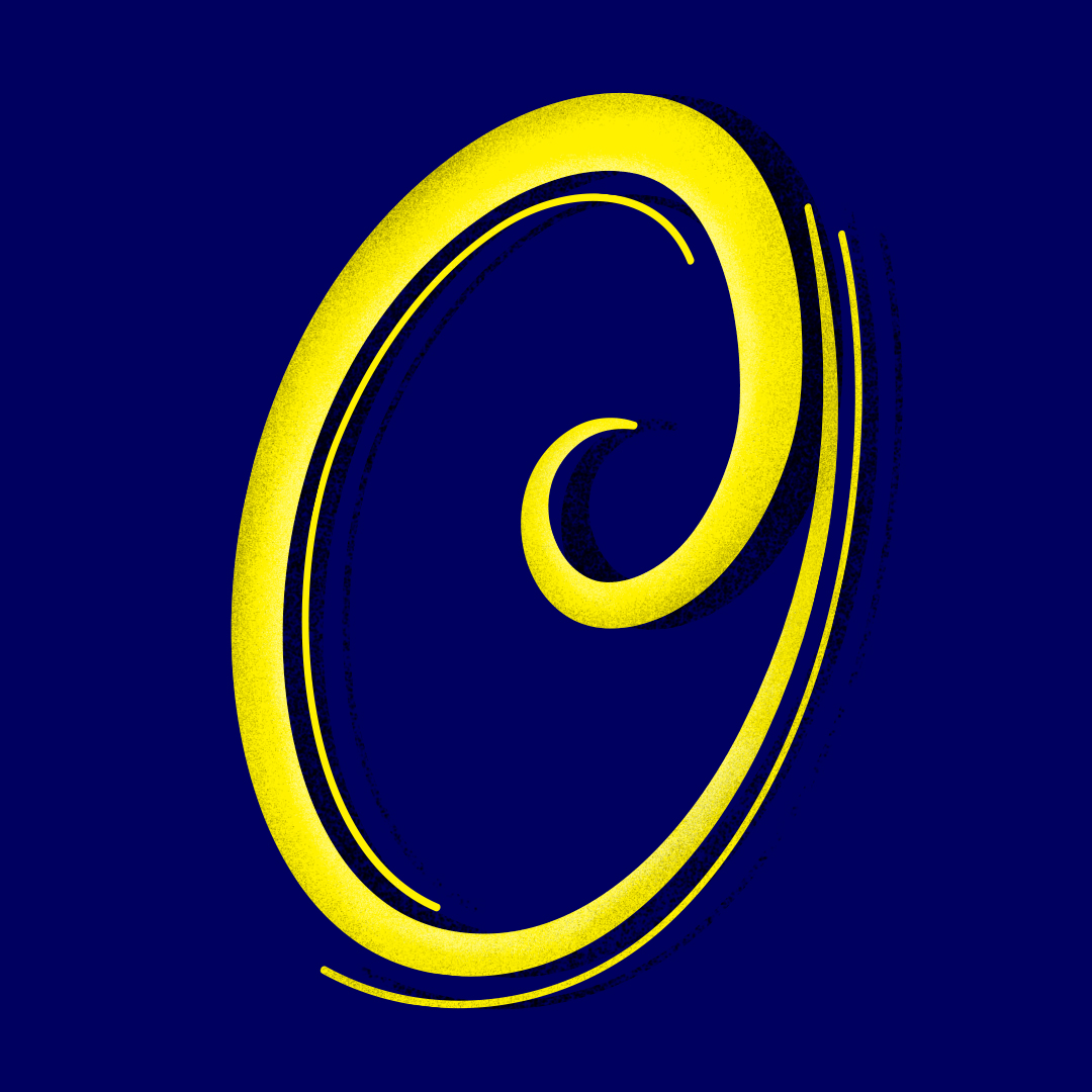
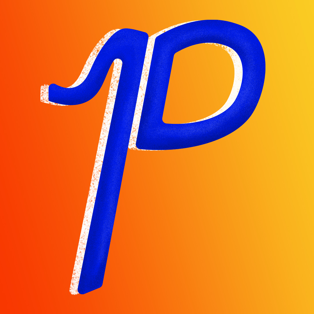
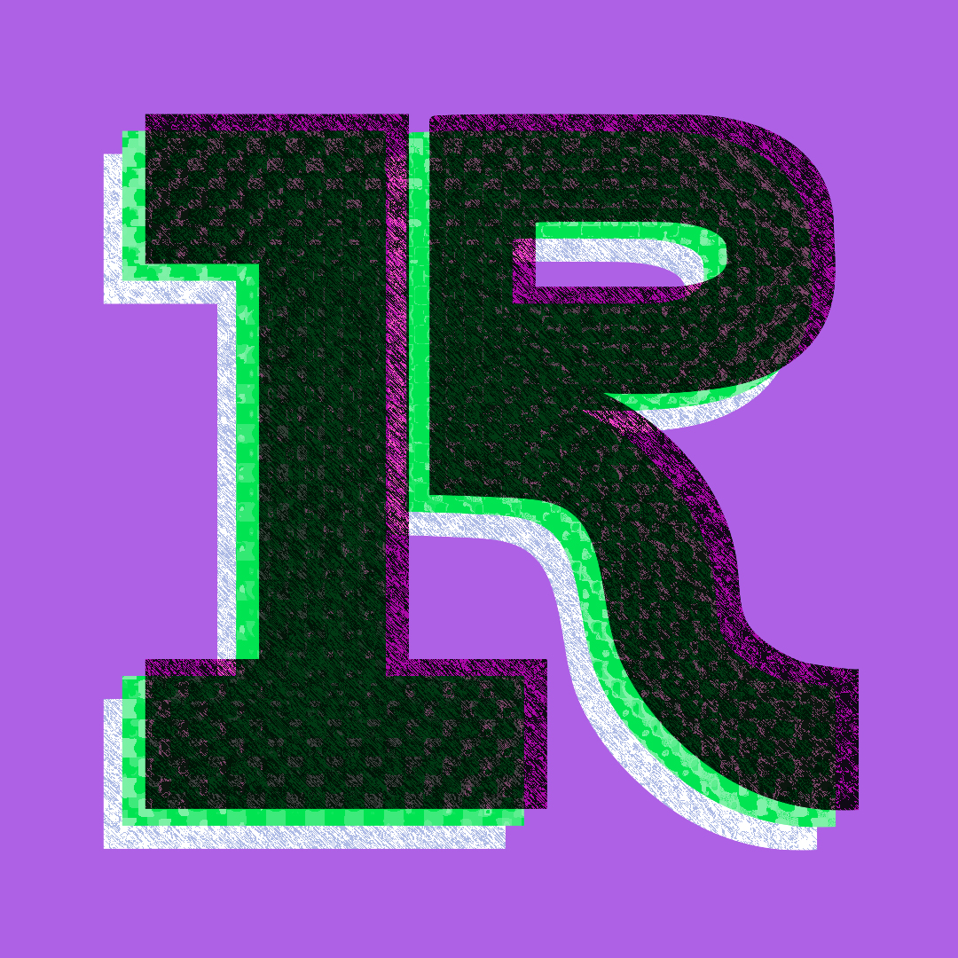
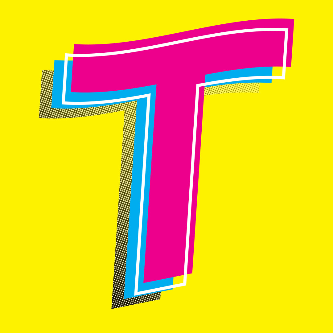
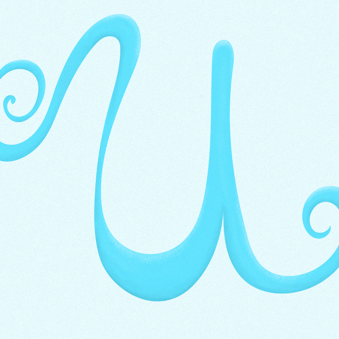
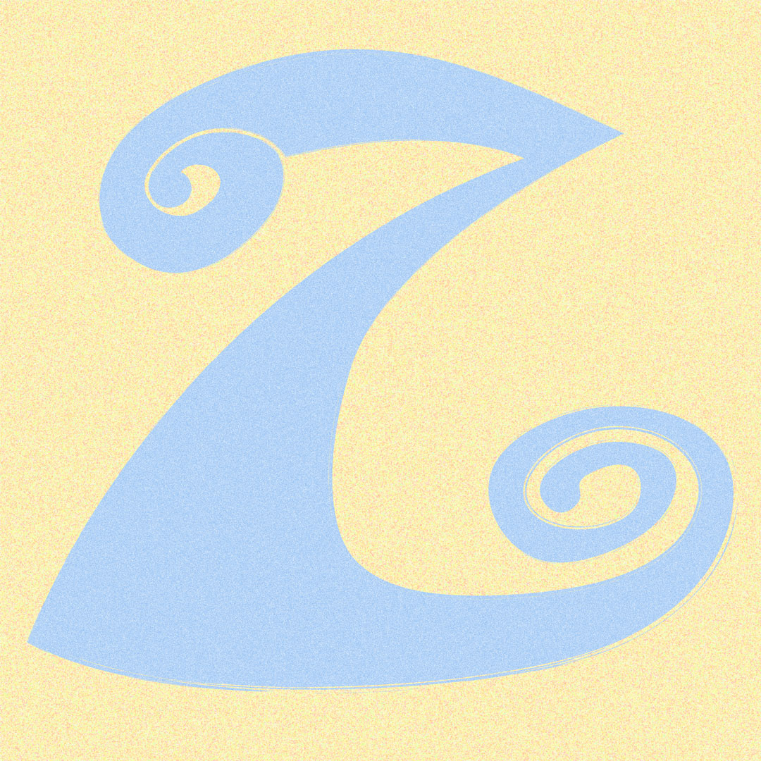
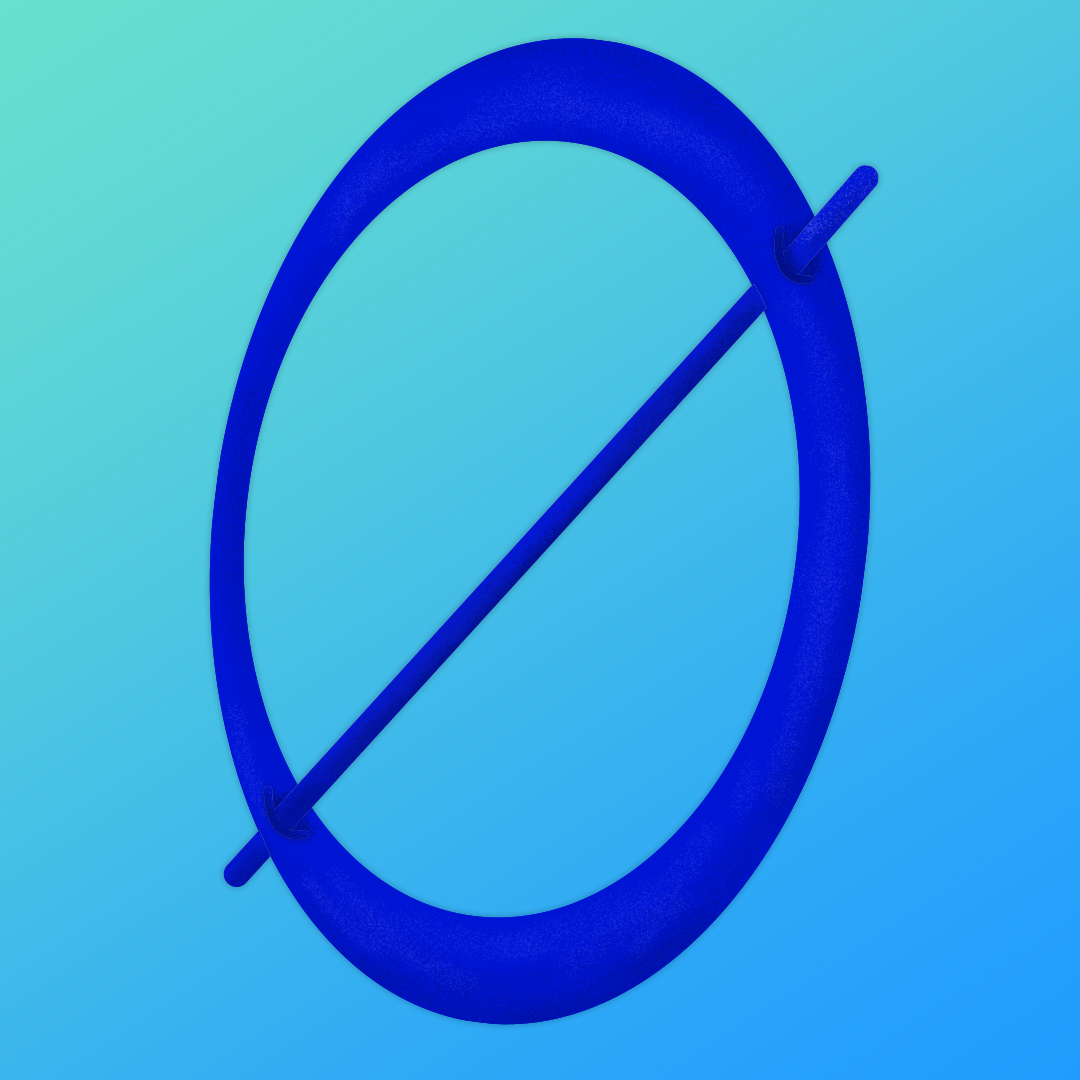
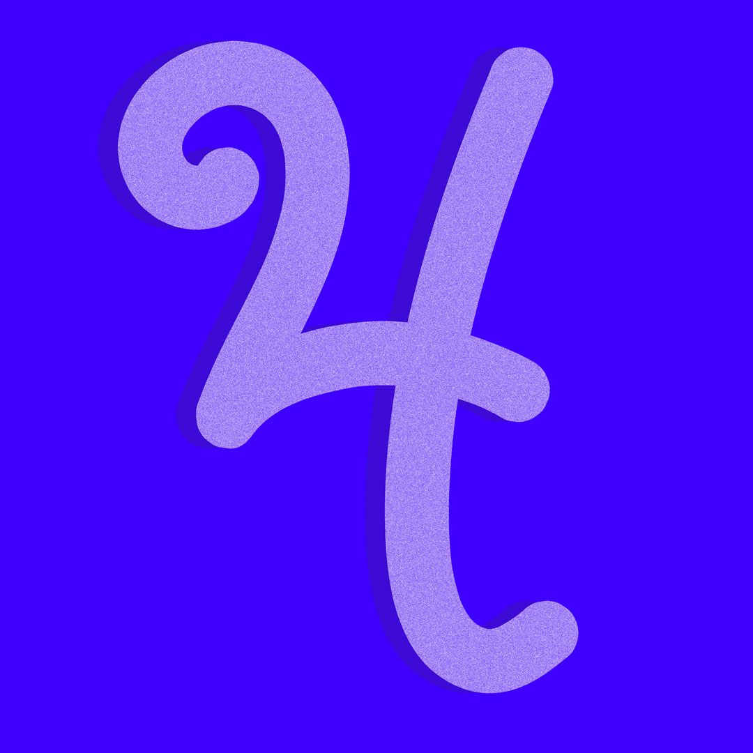
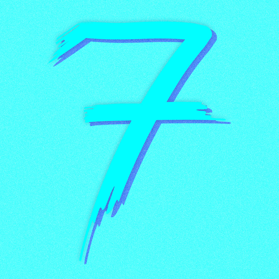
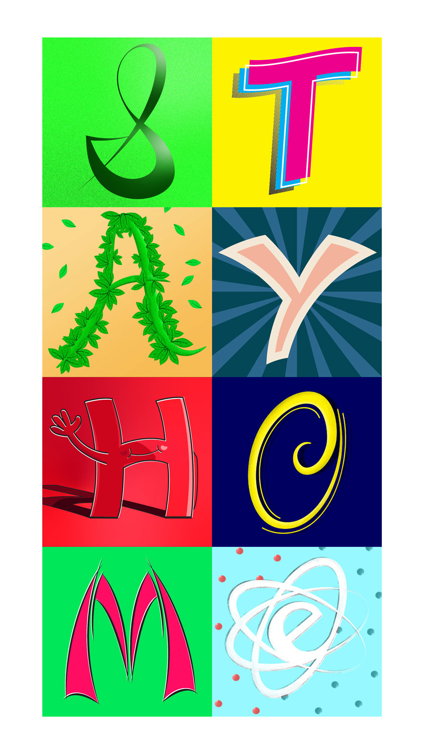
This gallery of letters was my first official entry participating in #36daysoftype. I've been wanting to take on this project for years now. Alas, a lack of motivation and creativity was holding me back. 2020 was a little different, with the accountability of my good friend Ari (@ahhrreee on Instagram) I finally found my determination to take this on! Similar to my album cover designs, this project helped me to find inspiration in design when the creative juices weren't flowing. This project showcases English letterforms as pieces of art. Some of the letters are more simple and true to their letterform, while other designs are more intricate being based on illustration.












BREAKING THROUGH CREATIVE BLOCK
Sometimes inspiration will show up in the most unlikely places. Sometimes, it doesn't show up at all. And sometimes you have to make your own. When inspiration is fleeting, one simple mantra I remember is ‘Just keep making things.’ Explore a new technique, style, or a design challenge to push your creative envelope. That’s partially what this typography challenge was for me. I’ve found these forced creative moments, while sometimes draining, can help produce complex work and solve creative blocks. The flip side to being uninspired is to lack motivation. They go hand in hand with each other. That’s where my accountability-buddy came in clutch and helped pull me through. Seriously, don’t underestimate the power of creative (friendly) competition to help drive yourself.
