Care and Counseling
Web Design & Development, User Experience & User Interface Design
PROJECT OVERVIEW
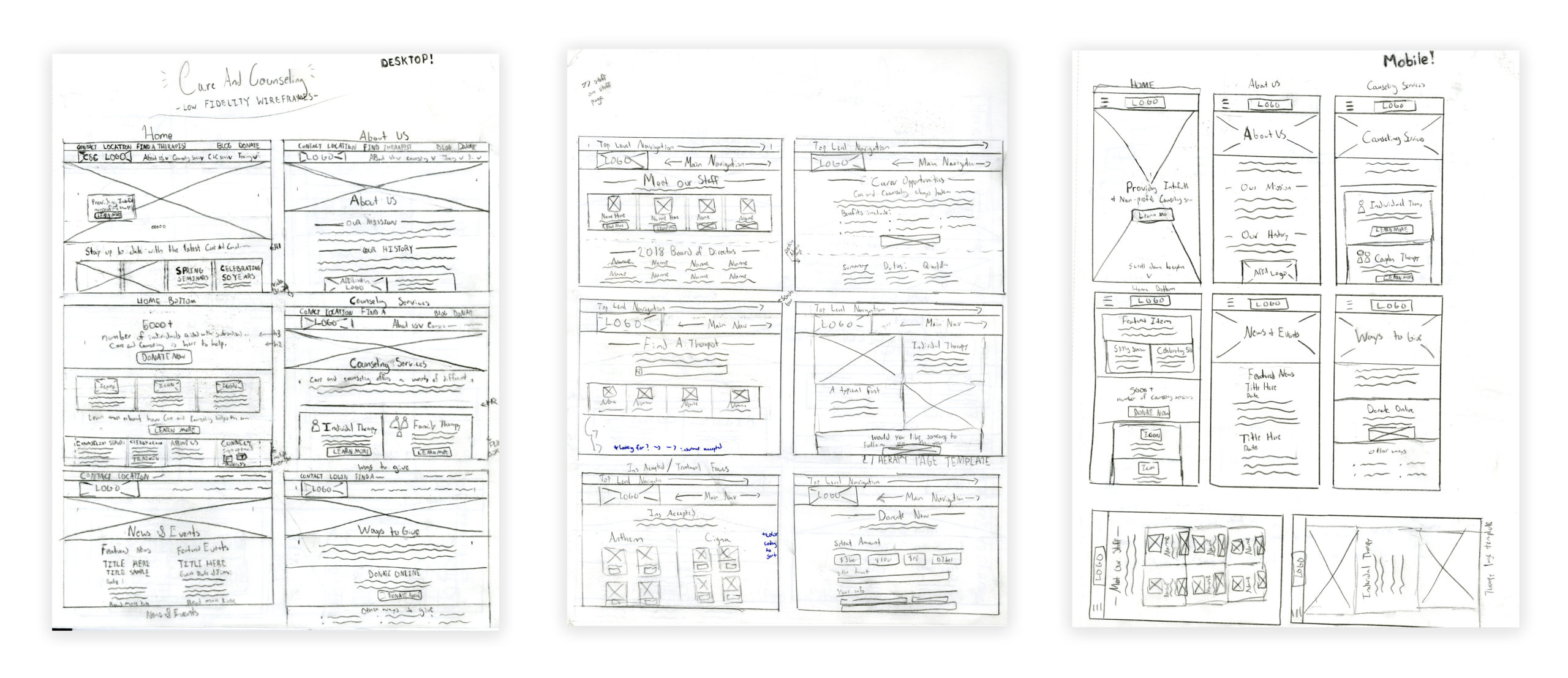
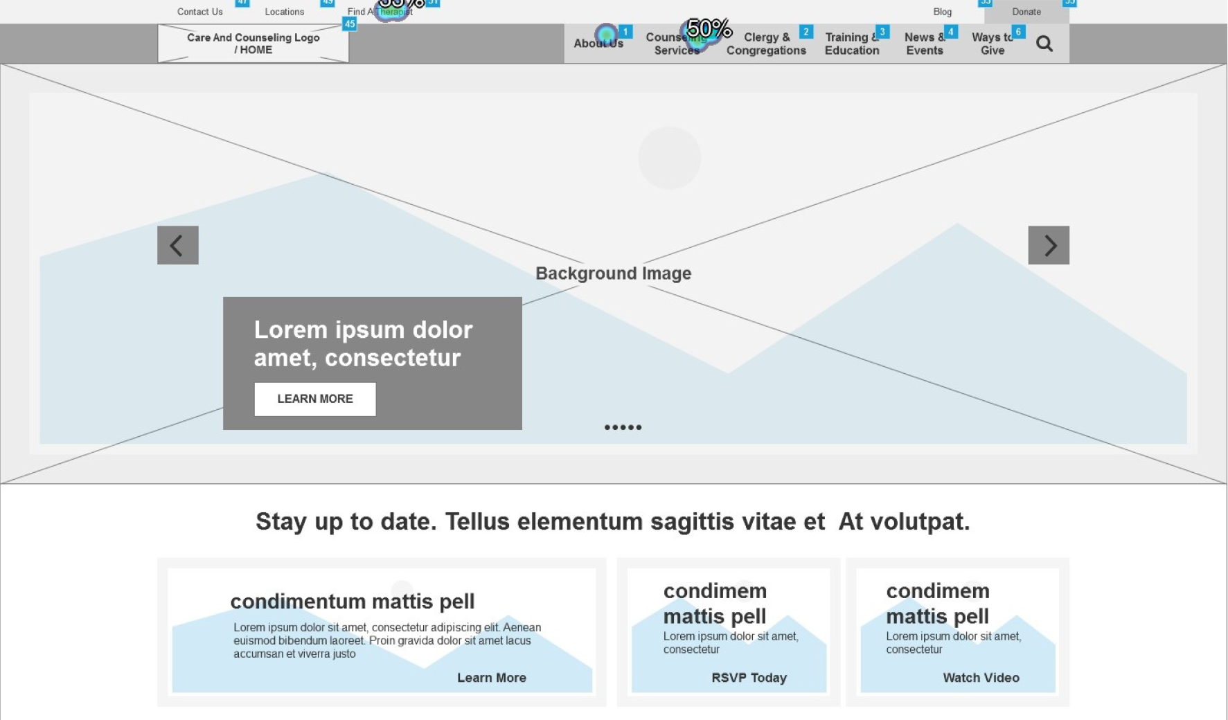
Care and Counseling is a nonprofit mental health organization located in St. Louis, Missouri. In 2018, I redesigned their website from the ground up. The project was completed over 4 months. There were two main objectives with this website redesign: firstly, creating an engaging, secure, and modern website; that is user friendly and can easily show the services provided by Care and Counseling. Secondly, to design a website that helps to strengthen the brand identity of Care and Counseling and showcase the organization as a leader serving the most vulnerable in the community. A phased approach was taken to achieve project goals. Project phases consist of Discovery & Definition, Diagram, Design, Development, and Deployment. Each stage had specific deliverables, including qualitative research reports, user profiles, digital presence audits, and low/high fidelity wireframes.

THE PROBLEM
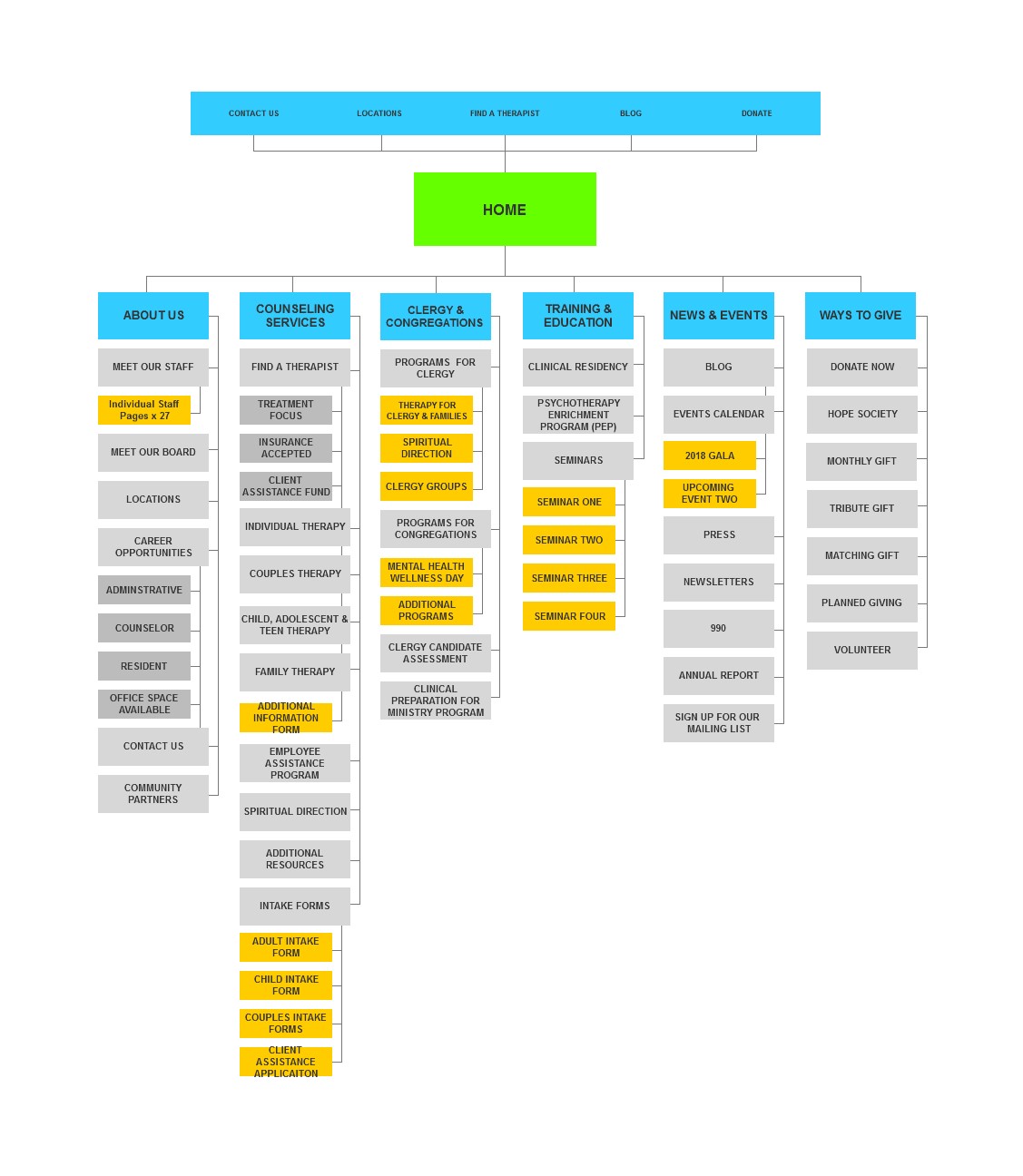
During the Discovery & Definition phase, we identified two main issues: 1) The original website wasn't built to be mobile friendly & 2) it wasn't organized for users to find the correct information needed. Solving the first problem was a matter of using responsive web design principles in creating the WordPress website. I focused on what the mobile experience would be like before working on larger devices such as a desktop. Information architecture, or how the site organizes content, required a complete overhaul. Getting qualitative user personas was a significant asset to the project. After establishing the user personas, it helped to identify precisely who the website was serving and what information they would find most useful. Starting with card sorting exercises, I worked with key team members to reorganize the site navigation. Card sorting can help on a larger scale to get an idea of how web pages should be grouped. This information was later refined and tested with our users to create the final site map.

DESIGN SOLUTION
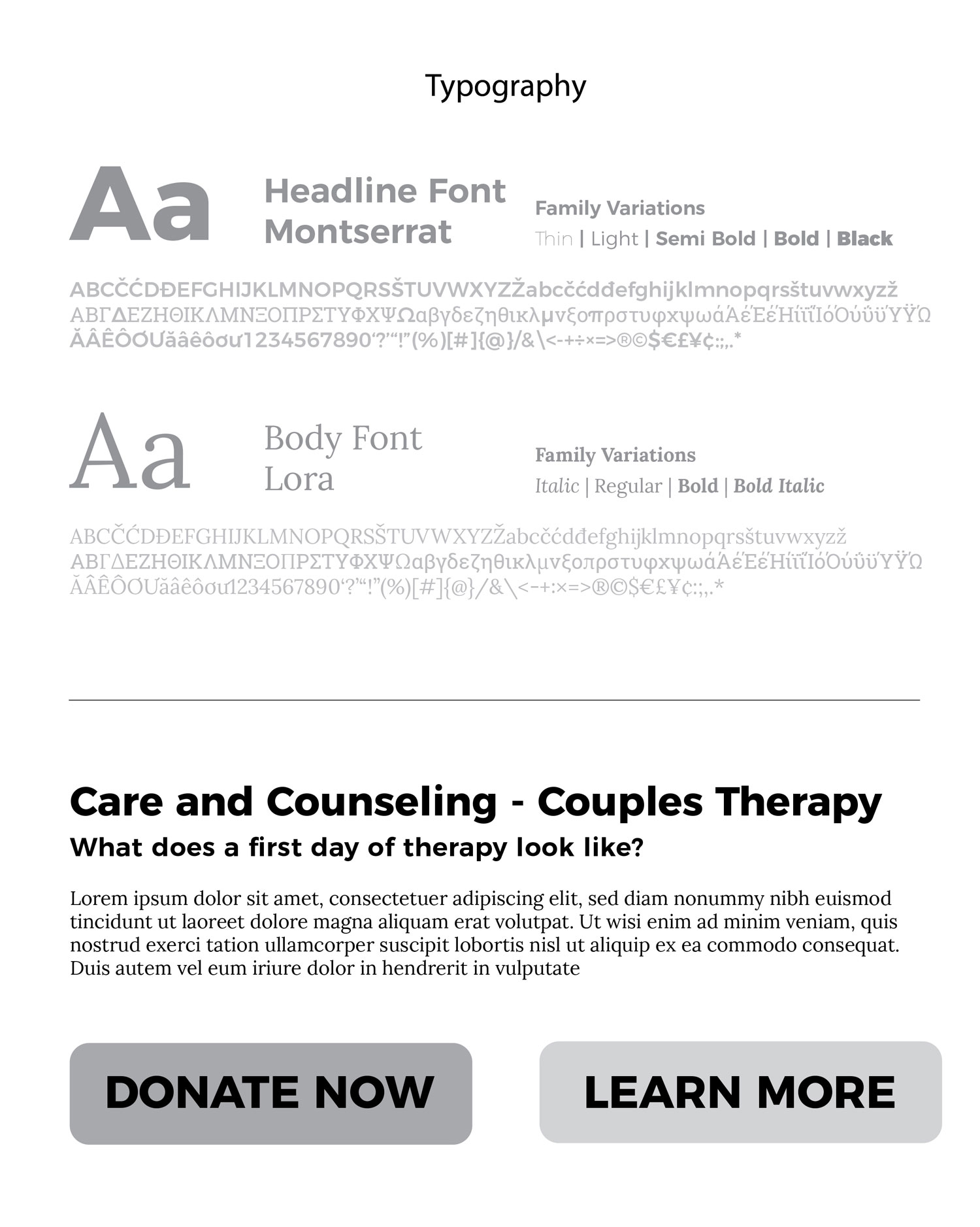
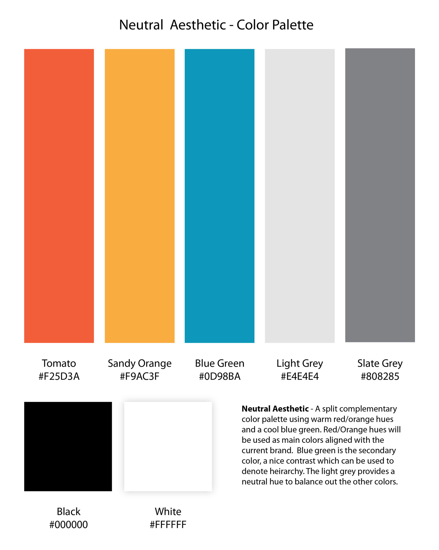
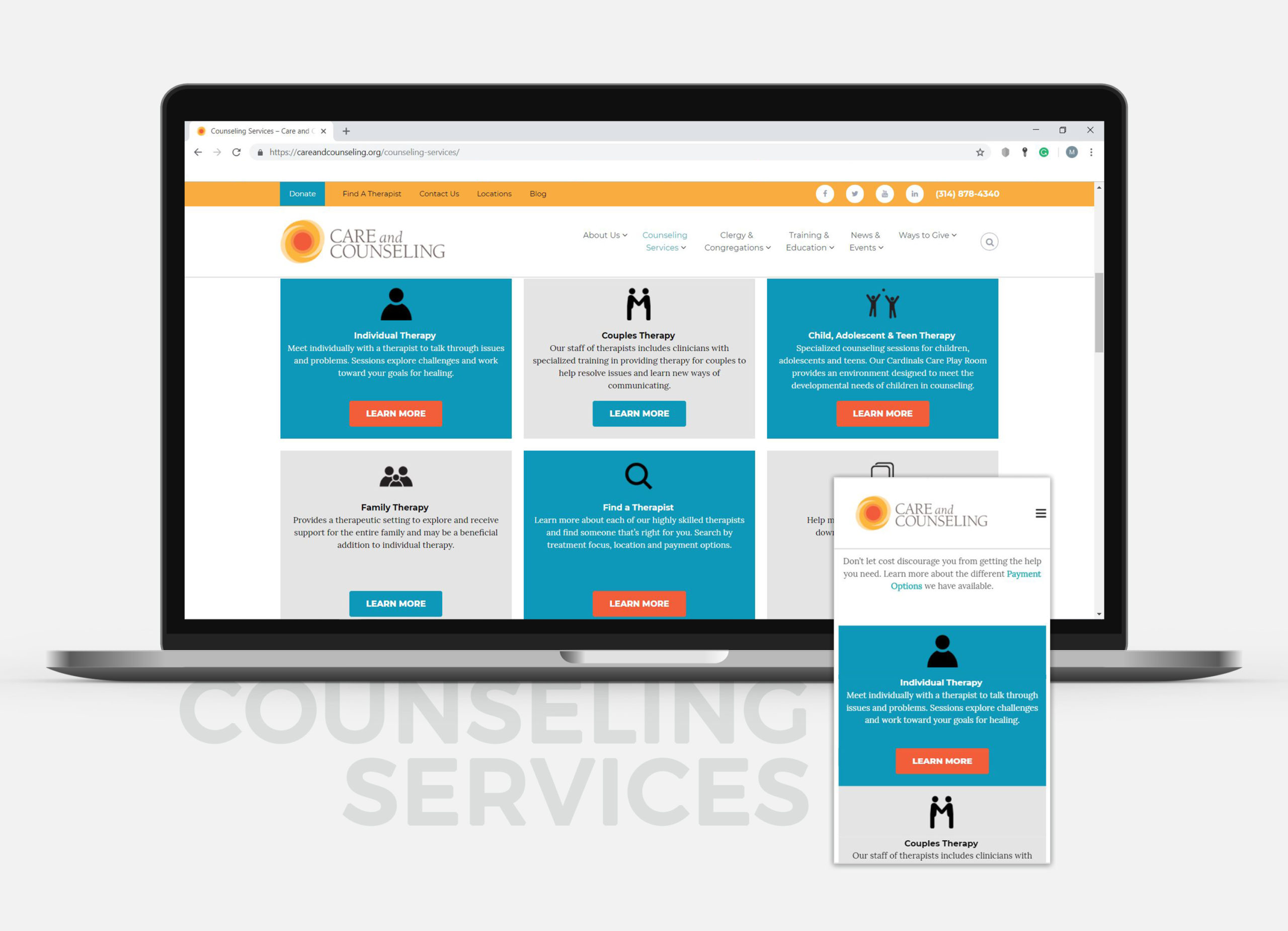
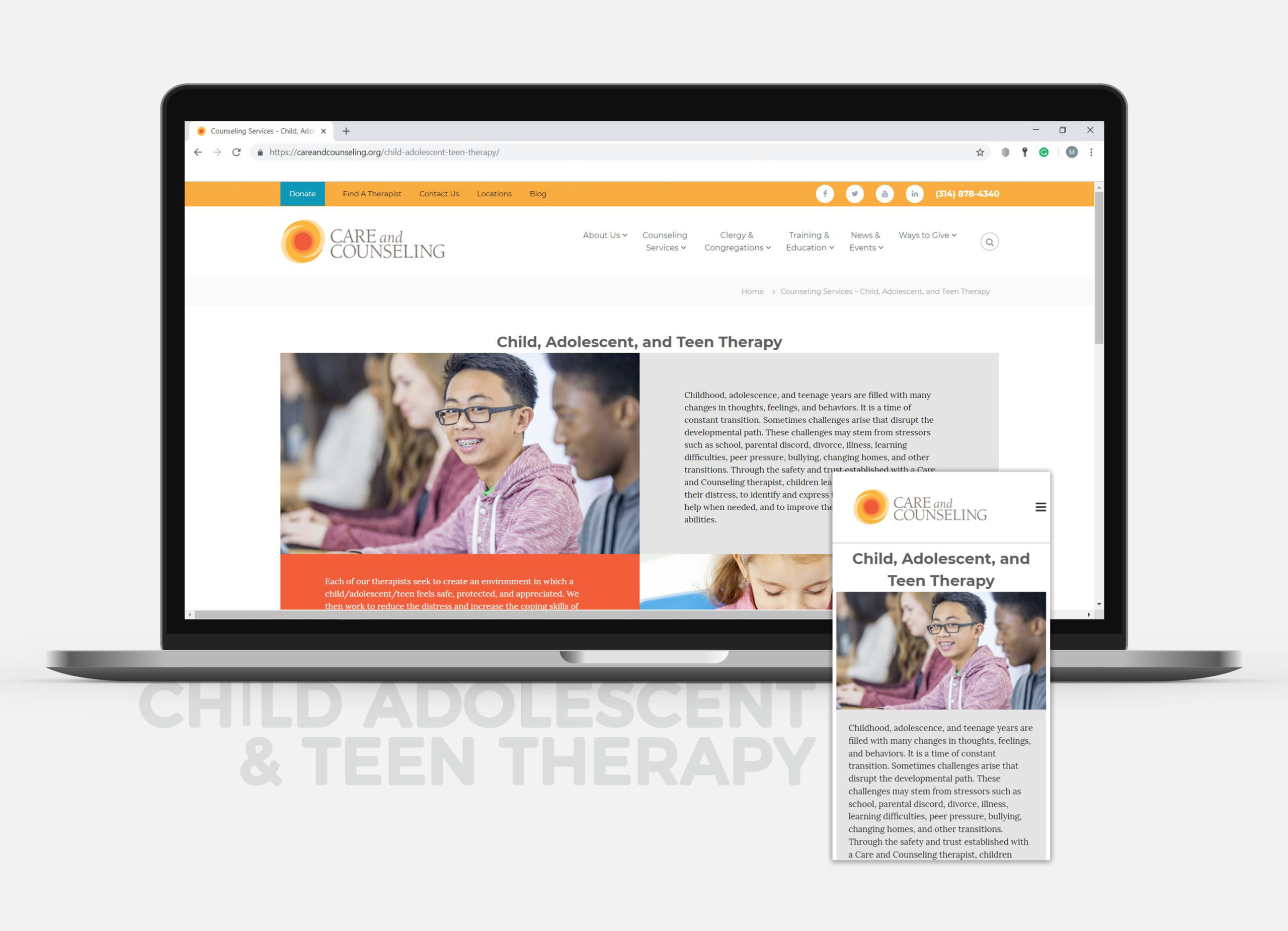
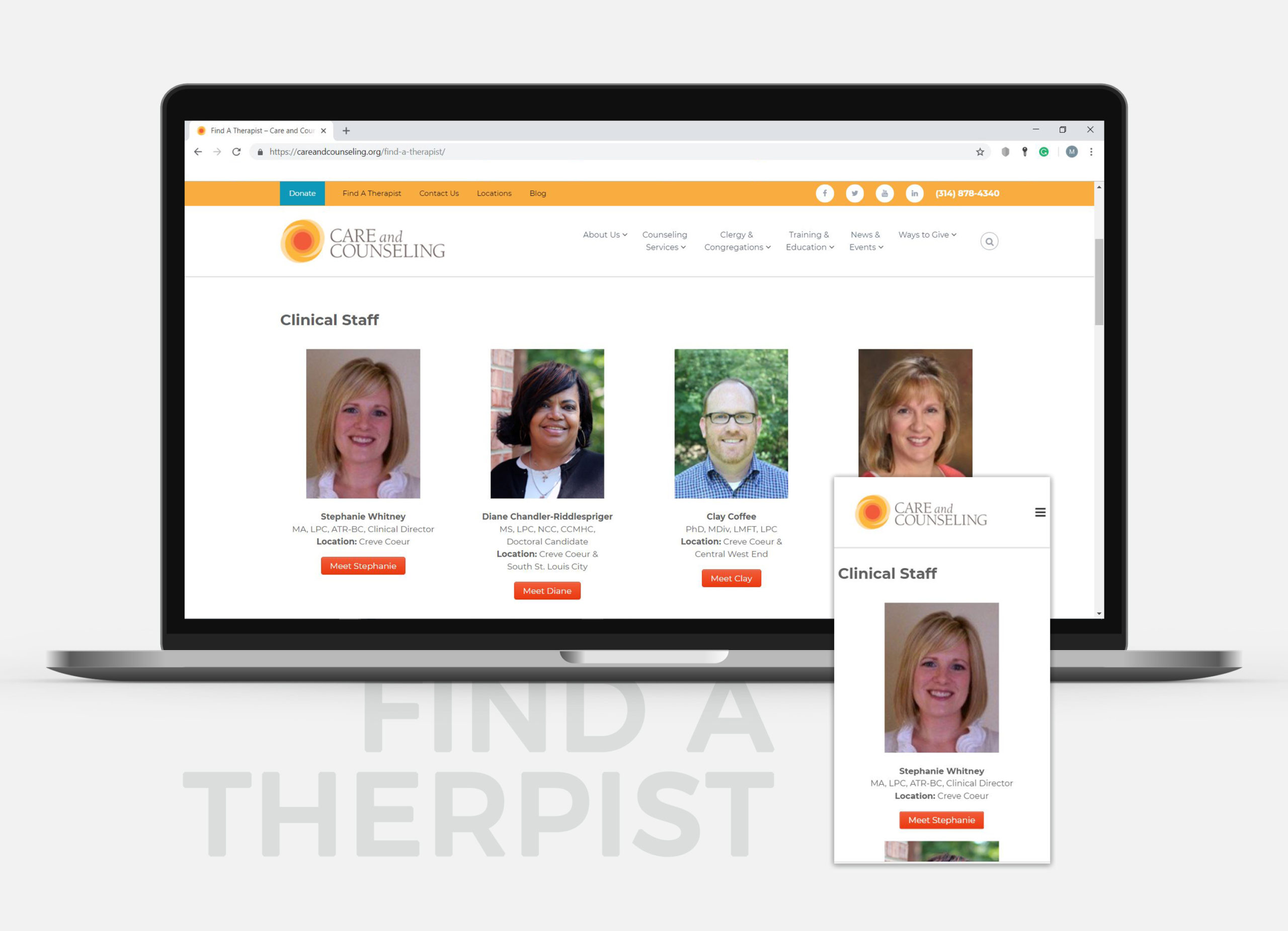
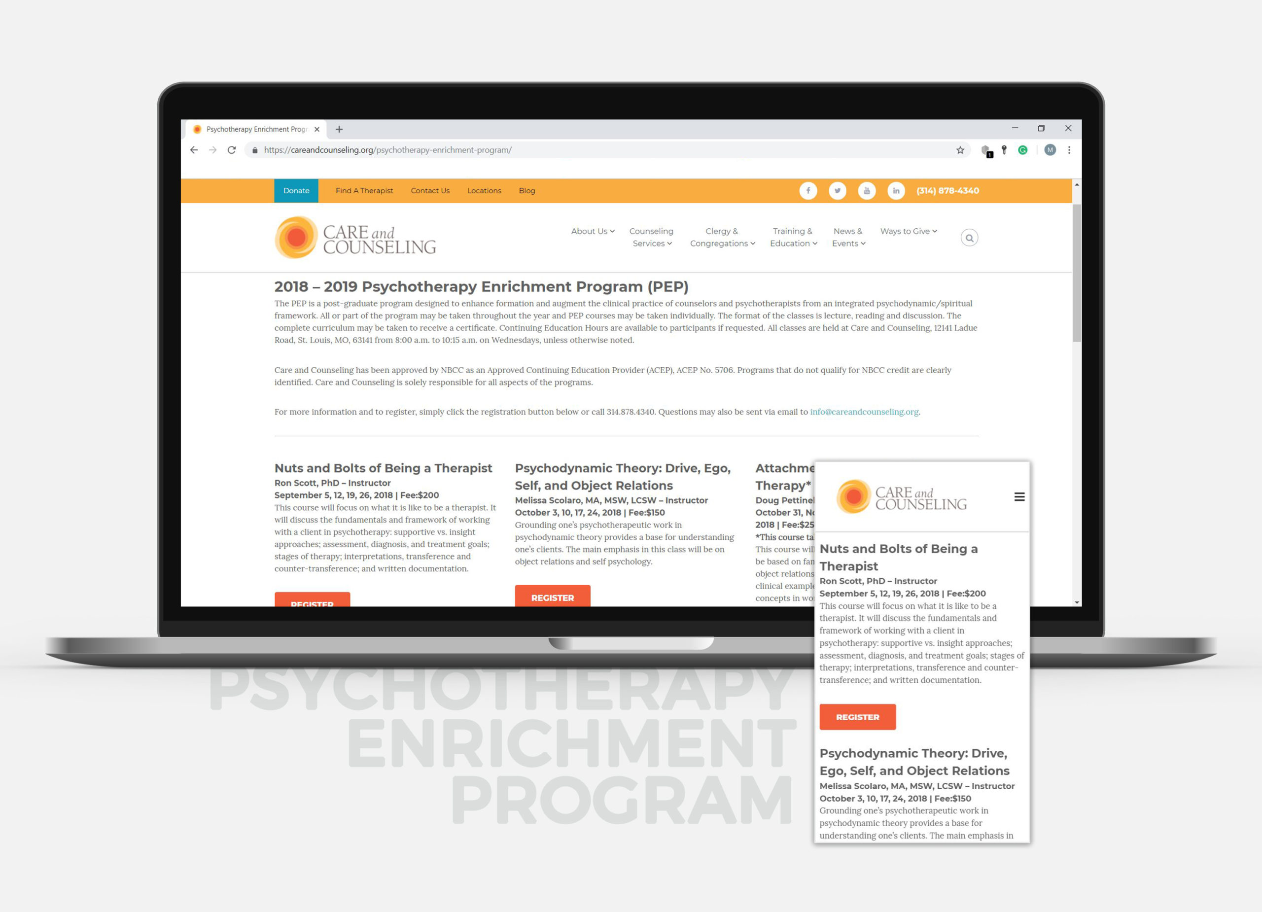
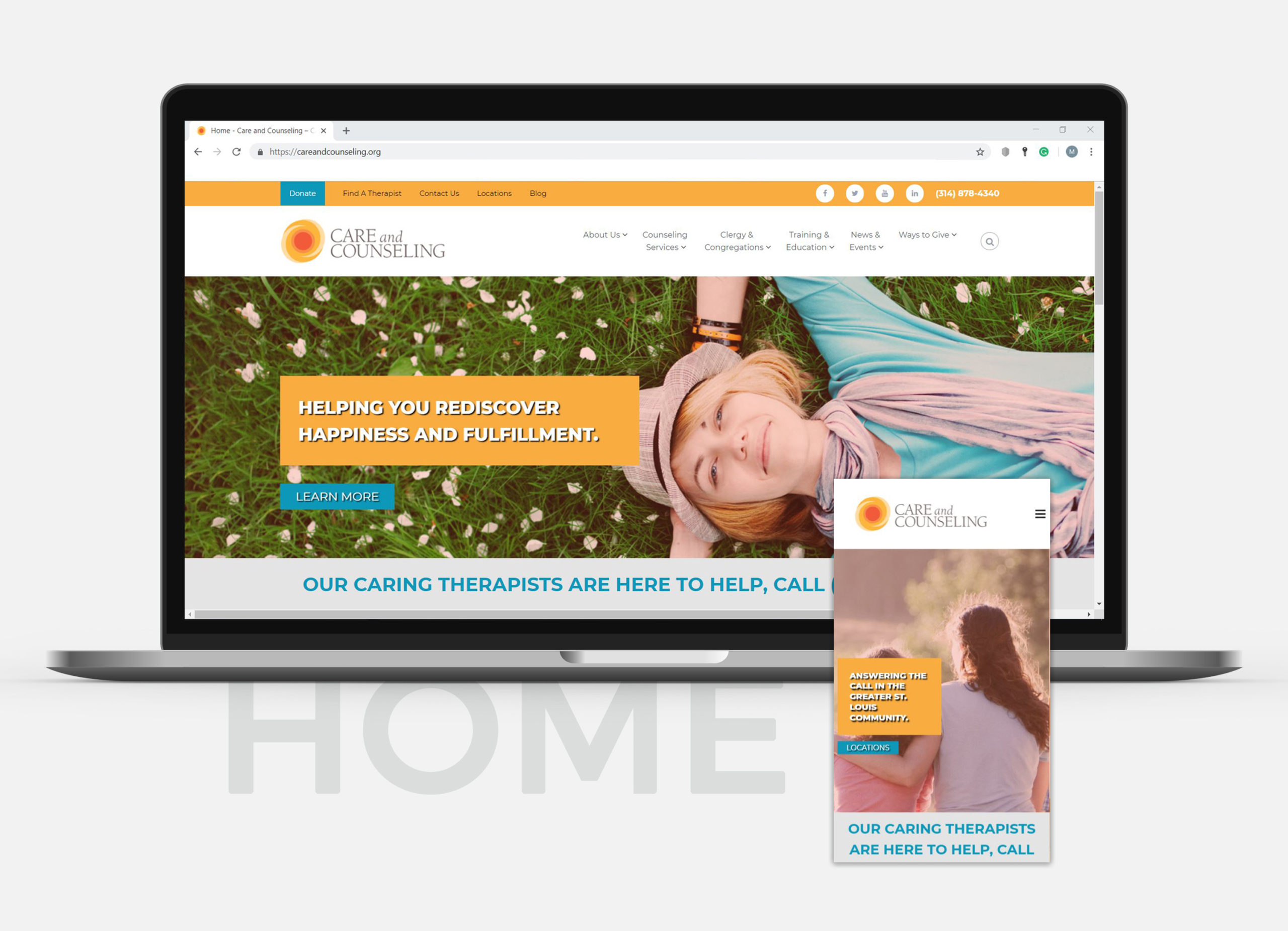
Solving the user experience issues was one side of the project, the other was needed to redesign the website and strengthen their brand identity. Through discussions with key team leaders, we developed a design strategy for the website. Warm, inviting colors were used to convey the comforting personality of Care and Counseling. Larger images with color overlays were a new feature added. Additionally, custom iconography was incorporated into the website. Typography was chosen with the best readability in mind and finding ways to better utilize a CTA (Call to Action) on the website. These new design features helped to showcase the identity of Care and Counselings brand. Being an expert providing a trusted experience, helping to make an impact on those in need.
