Do Good Kombucha
Web Design & Development, User Experience & User Interface Design
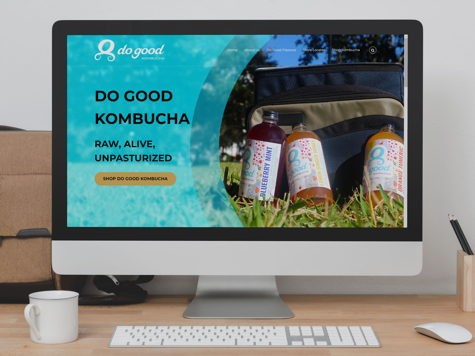
PROJECT OVERVIEW
Do Good Kombucha is a newly established Kombucha business located in Kemptville Ontario. Prior to this project they had no website and most of their online presence was on social media. They were looking to have a website built that people could purchase kombucha from online and serve as a resource for their business information and strengthen the brand. This project was accomplished by completing a design sprint to fully understand the problems and issues before starting any development. Following the design sprint, low fidelity wireframes were created before the final website development and launch. All aspects of the website including animation and photography were created by myself. I also helped design the kombucha labels for the different flavors.
THE PROBLEM
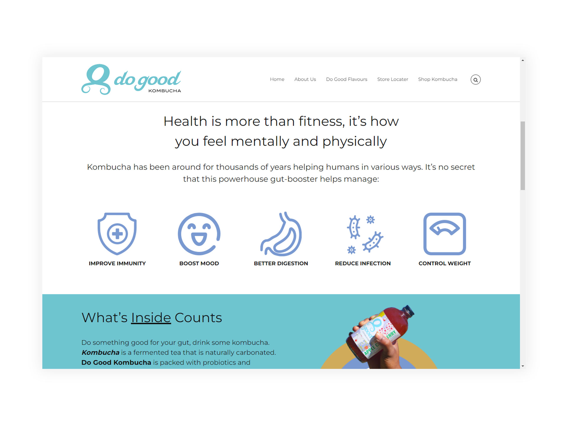
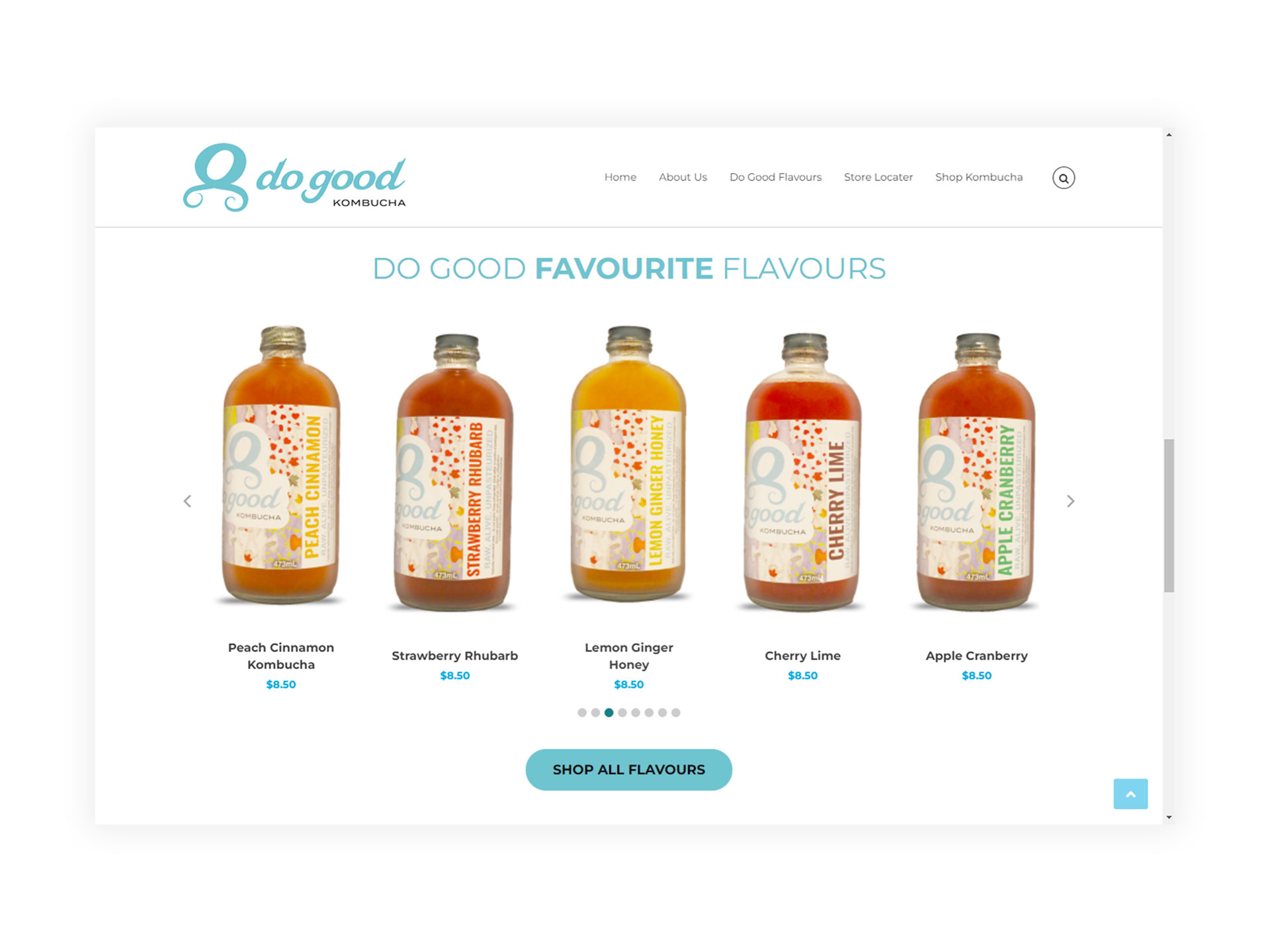
During the initial design sprint we identified a two main issues to address on both the user experience side as well as in relation to the business context. With input from the business owner we discovered that some people are skeptical and unfamiliar with what kombucha is and the benefits the drink can provide. The skepticisim combined with some people that may have had a bad experience with kombucha showed that some people could be detractors before giving Do Good Kombucha a chance to stand on its own. In relation to the business, the product is available at a few physical locations and they want to grow into the online realm having another avenue that kombucha could be purhcased. The website needed to inspire people to do something healthy for themselves while strengthening the brand and showing how they support the local community.
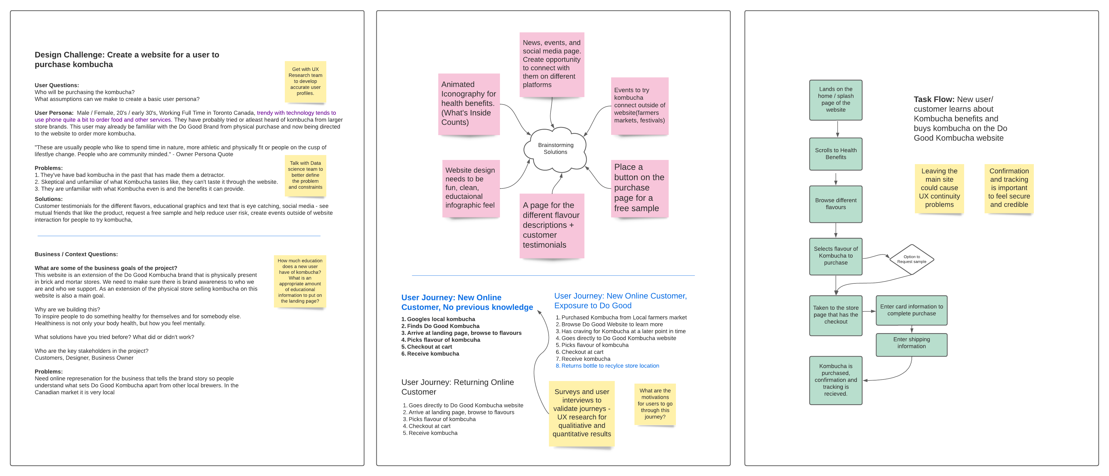
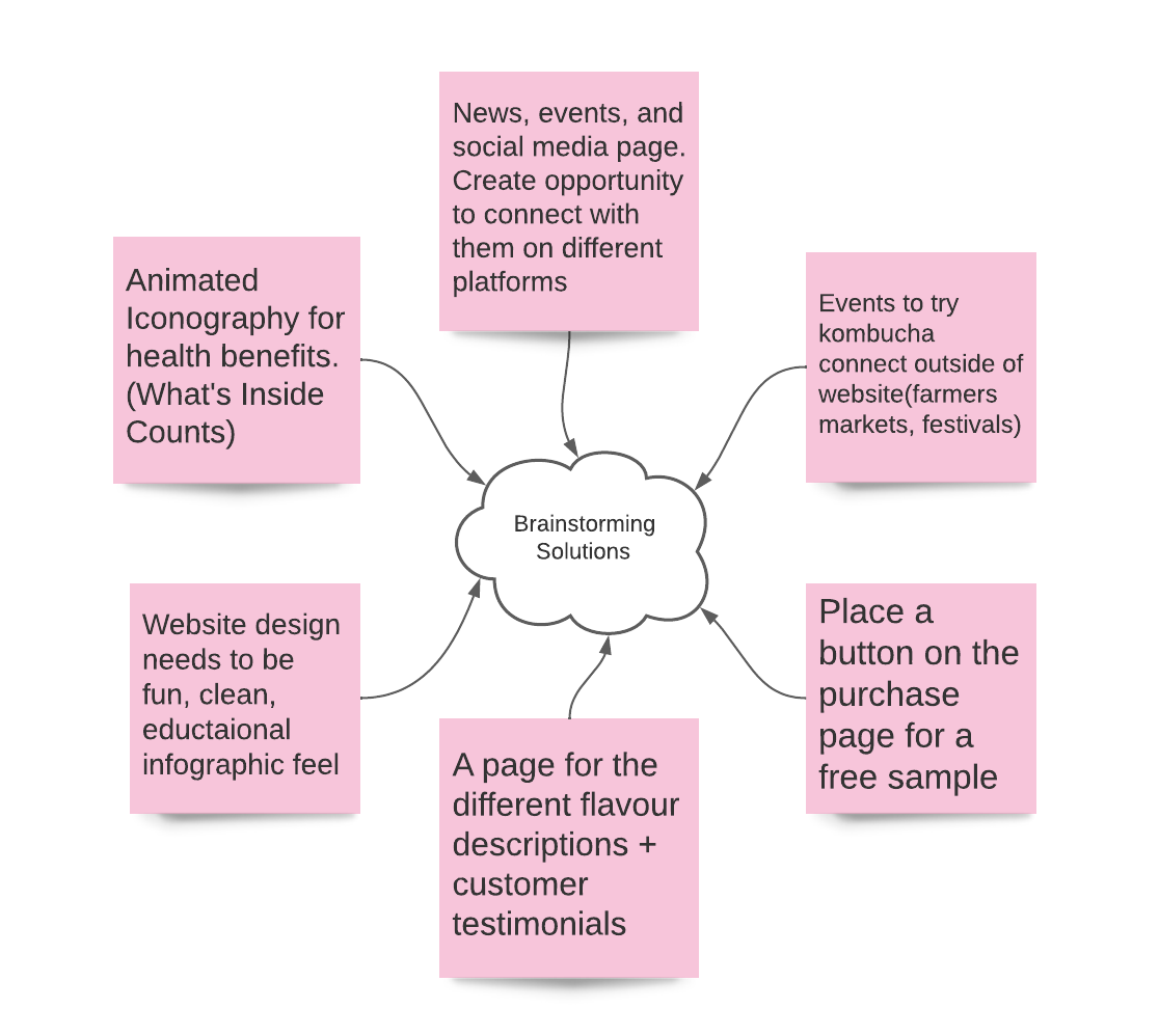
Through the collaboration of the design sprint we were able to identify a few potential user journeys. We focused on creating a user journey for a customer that was new to the brand and had no previous knowledge of what kombucha is. The task flow was important to identify how the user would move through the website with the final goal to be to purchase kombucha from the website. We also explored a few design solutions such as animation to help make the website fun and easy to learn more about kombucha and the potential benefits.
DESIGN SOLUTION
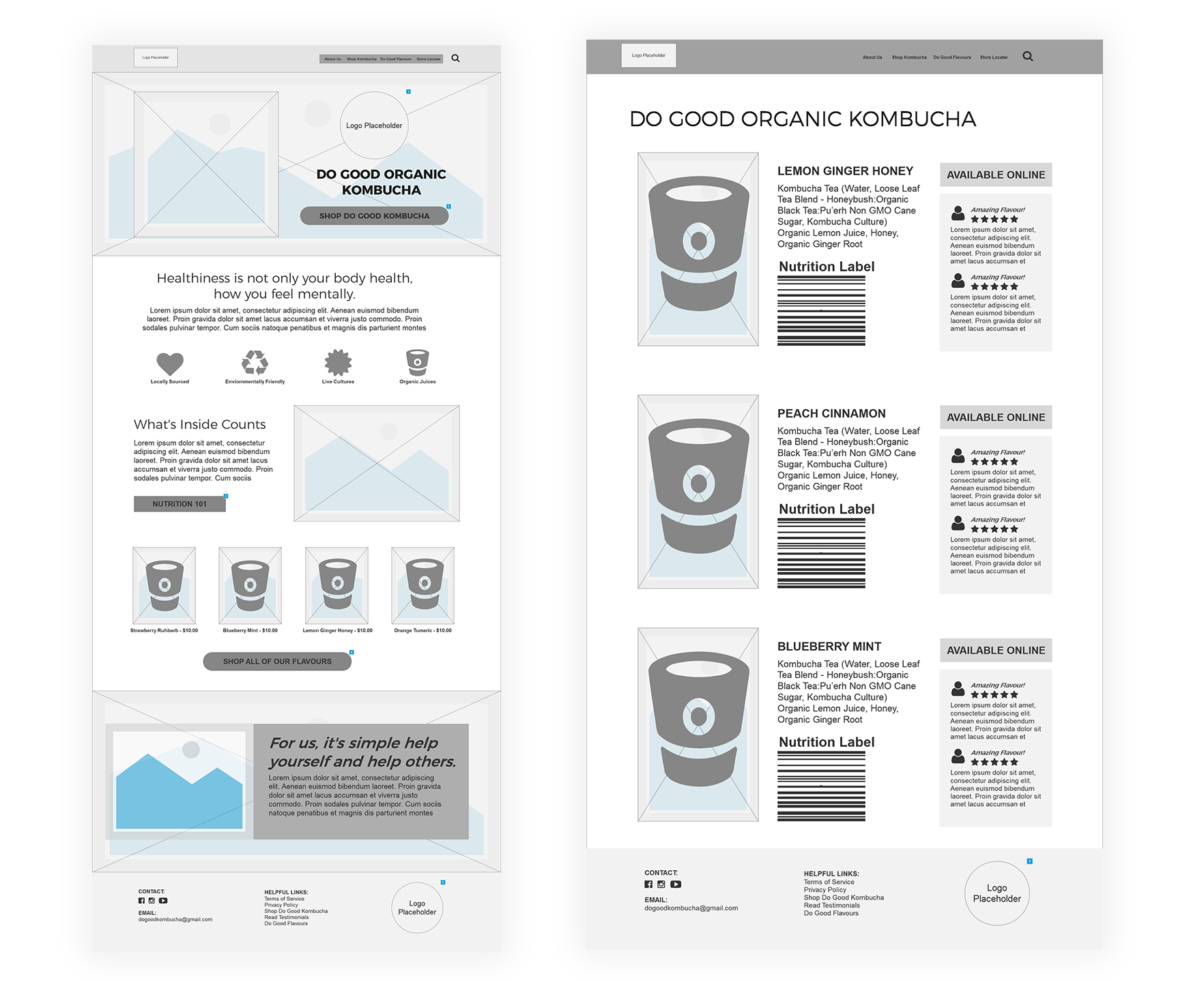
The intial designs were created in low fidelity wireframes to help finalize layout details before adding in pictures, colors, text, etc. It was decided on that on the home page we would take a fun inviting approach to be more education focused for the new user. Animated icons were created to highlight 5 key benefits of kombucha and we also included more standard information to explain what kombucha is to the general public that may not be aware.
