ST. LOUIS JEWISH LIGHT
Editorial Layout Design, Art Direction
PROJECT OVERVIEW
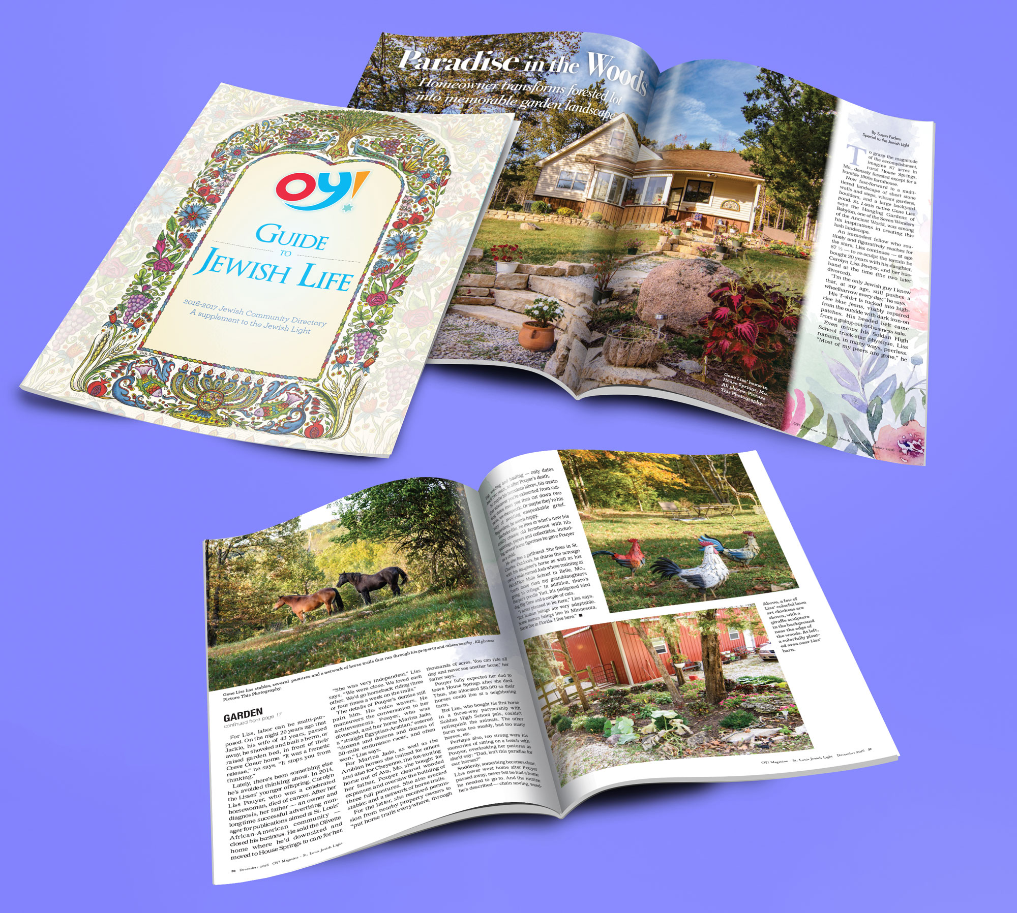
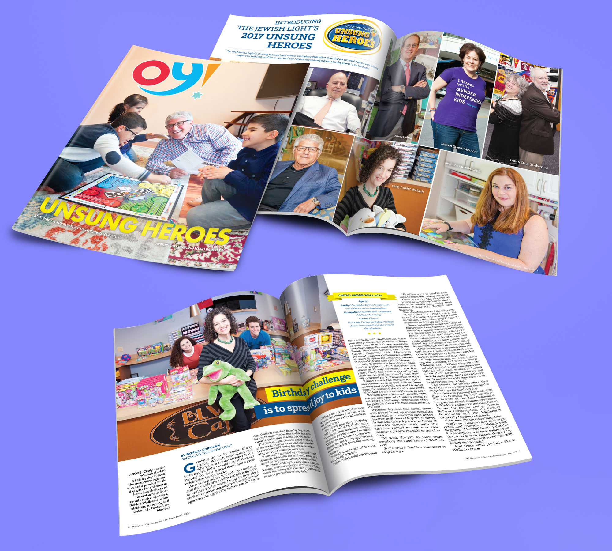
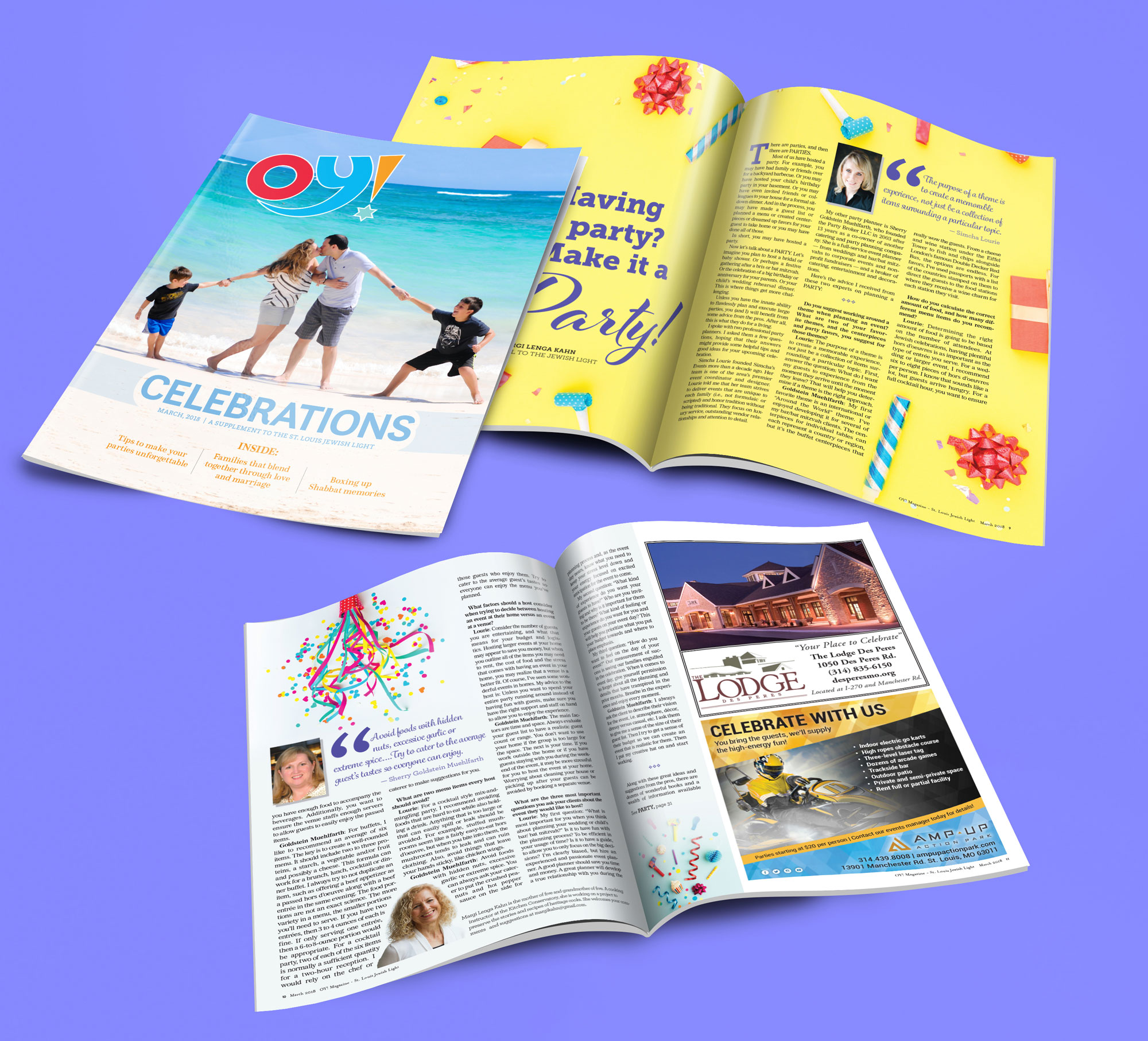
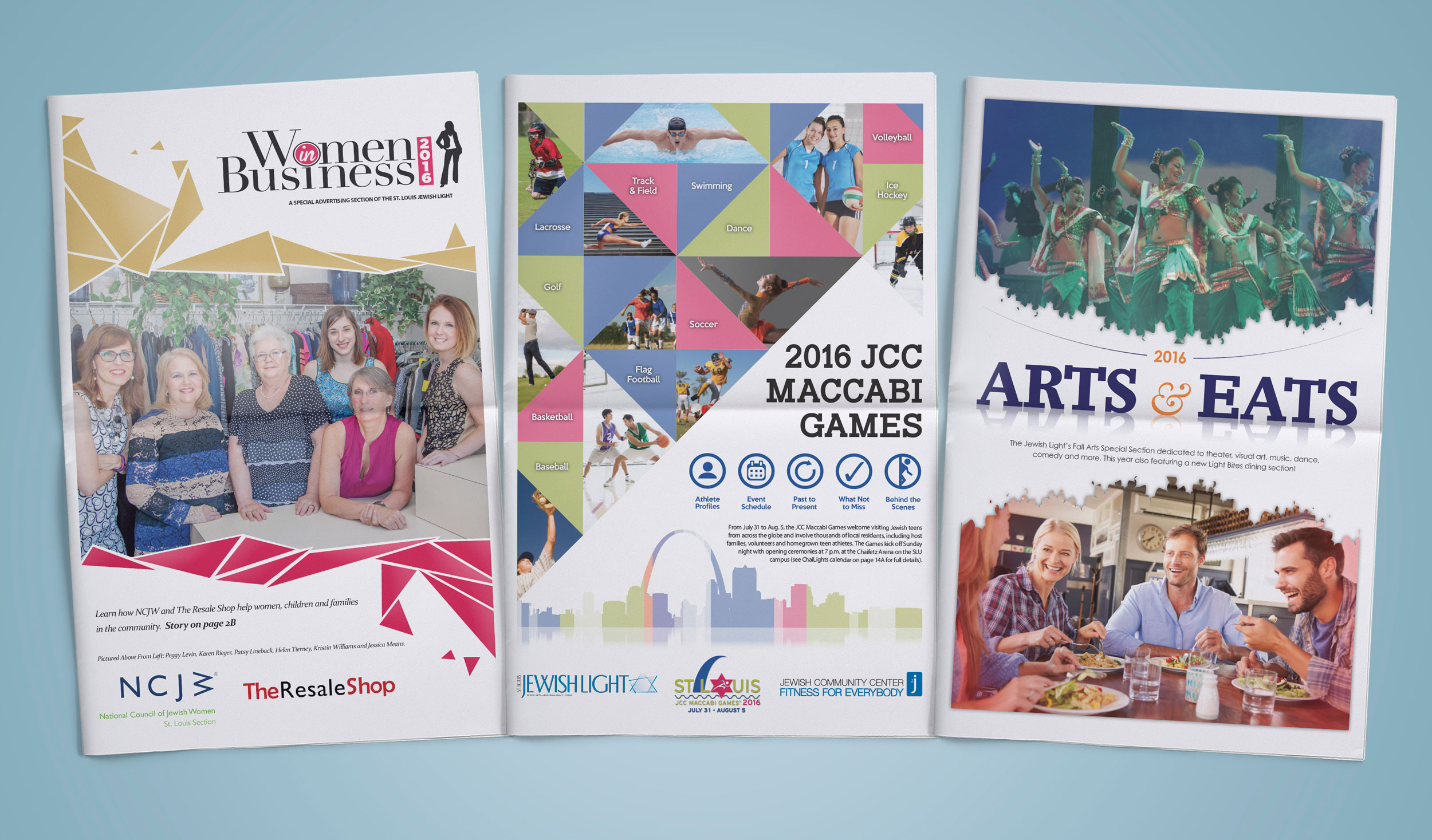
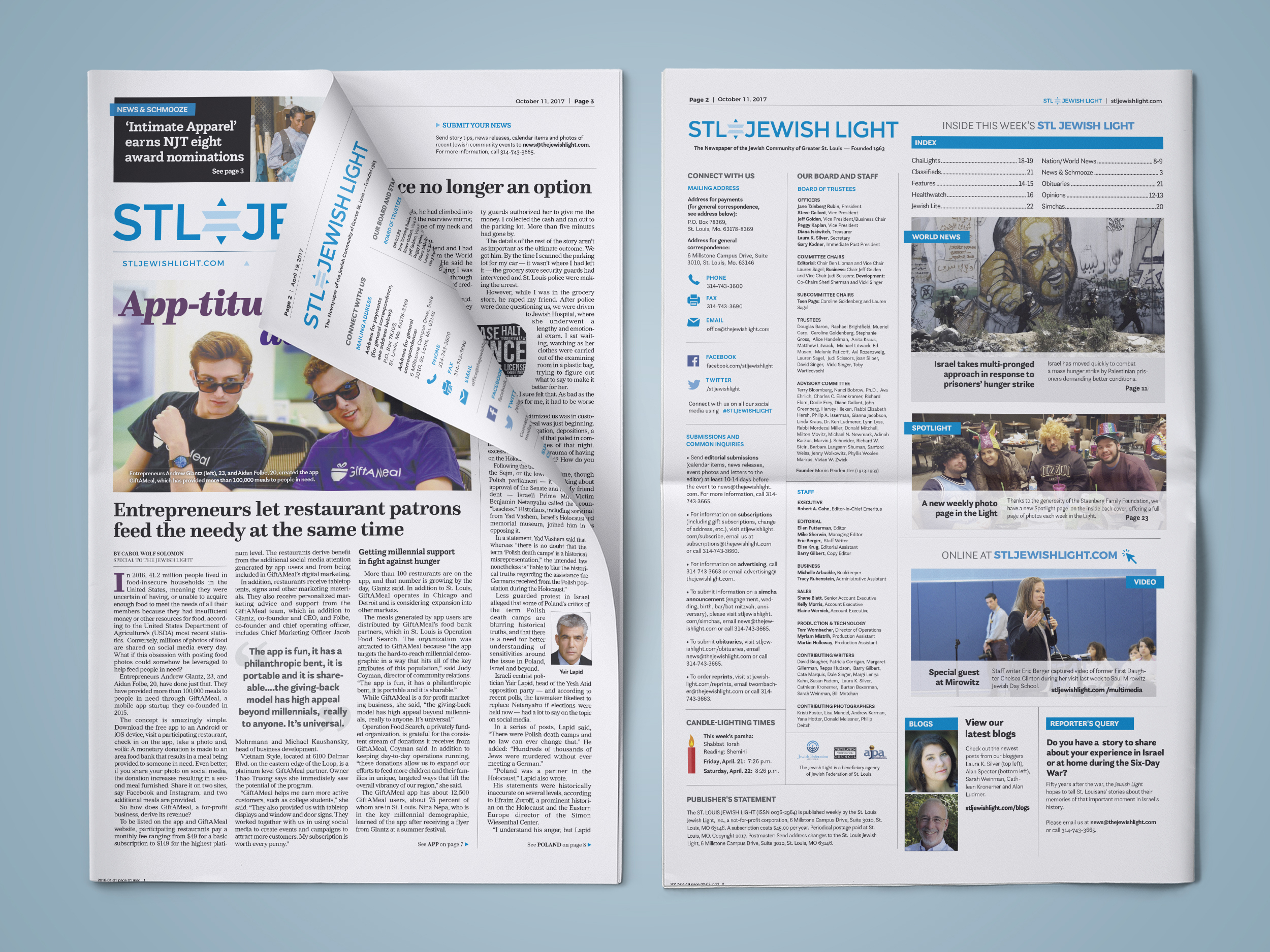
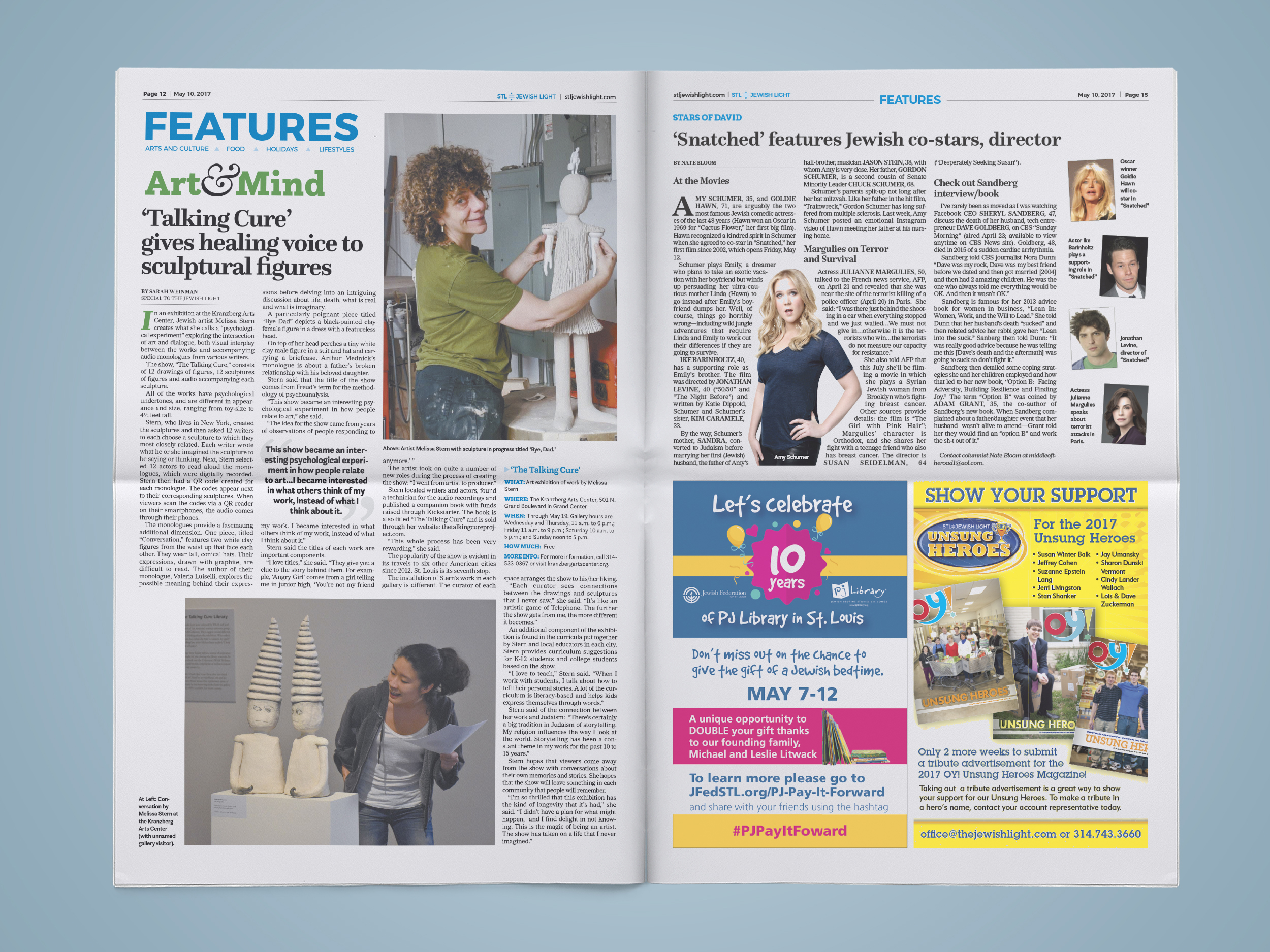
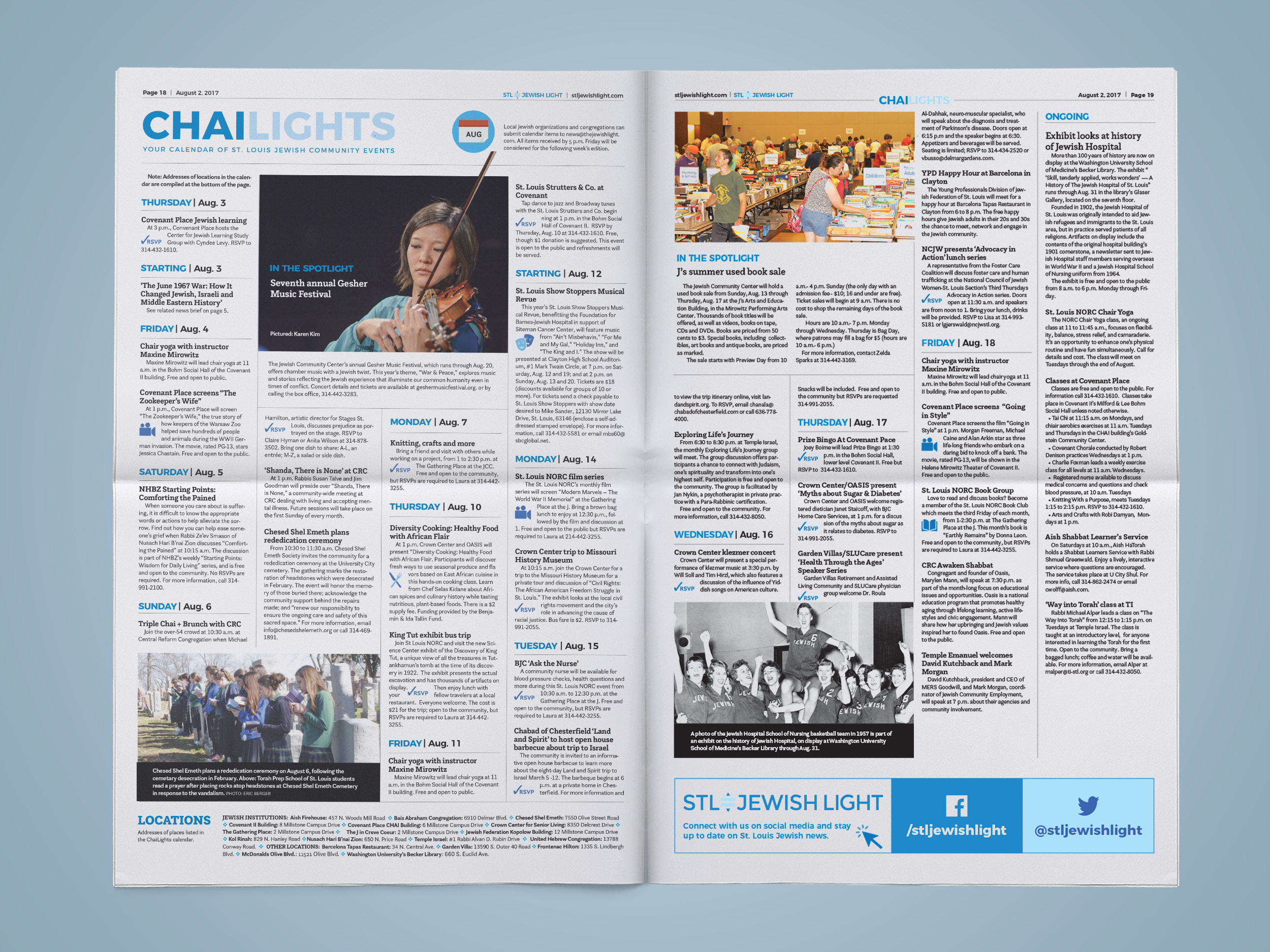
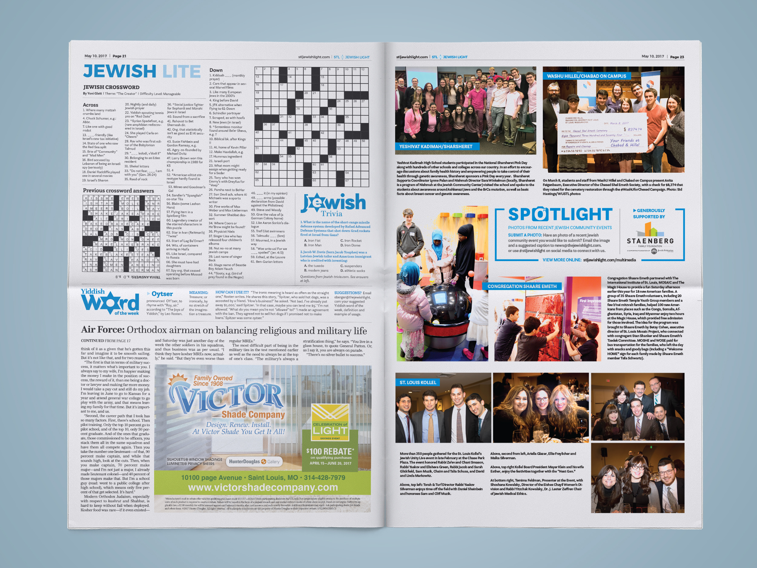
Editorial layout design was an integral part of my role as a Graphic Designer at the St. Louis Jewish Light between 2015 - 2018. A newspaper is printed weekly, along with a magazine quarterly. For each publication, I would set the layout of ads, preflight all of the ads, and design pages according to layout style guidelines. Above, you’ll see cover designs for various special sections. Below are layout designs for the St. Louis Jewish Light newspaper and quarterly OY! Magazines
ART DIRECTION
Between 2017 - 2018, I worked as the lead designer to redesign the face of the St. Louis Jewish Light newspaper. As the newsprint industry and the Jewish Light paper were moving in a new direction, they wanted the newspaper to reflect a modern and visually exciting layout. While making the design modern, we also had to find ways to make it reader-friendly. The art direction had a strong focus on creating more room in the newspaper layout. Creating more layout space was accomplished by removing a repeating newspaper 'rail' in favor of more extensive graphics, custom typography, and illustrations for news articles. I conducted research and implemented new typography, page layouts, iconography, and color theory to highlight the objectives of the redesign. Read more about the redesign here.
